The Role of Social Media in Web Design
Written by Maya Collins | July 17, 2026
Social media does not just send traffic to a website. It changes what people expect the website to do the moment they arrive. That expectation is the real design pressure. The page has to load fast, make sense on a phone, and earn trust quickly enough that the visitor keeps reading instead of backing out to the feed.
If you are thinking about how social media fits into web design, you are probably asking a small set of practical questions: Should the site include share buttons? Is an embedded feed helpful or just clutter? What makes a link preview look good when someone shares a page? And how do you keep the design clean while still making the site easy to share?
Those are the right questions to ask. Pew Research Center’s social media fact sheet shows how deeply social platforms are woven into daily internet use, while Google Search Central’s responsive design guidance explains why a page still needs to work well on mobile, even when the visitor arrives from a social post. In other words, social media is not an extra channel on the side. It is part of the first impression.
Marshall McLuhan’s line, “the medium is the message,” still fits here. Social channels shape what people expect before they click, and the website has to finish the job after the click.
By the end of this article, you will know how social behavior affects design choices, when to use sharing tools and when not to, how to embed social content without slowing the page down, and how to keep the whole setup readable, accessible, and useful.
Terms worth knowing
Social media and web design overlap in a few technical places that are easy to explain once and easy to confuse later. I like to define the terms before anyone starts arguing about buttons, embeds, or preview cards.
| Term | Plain meaning | Why it matters |
|---|---|---|
| Share card | The preview image, title, and summary that appear when a page is shared | It shapes the first impression before the visitor lands on the site |
| Open Graph | A set of metadata tags that help social platforms understand a page | It helps control the title, description, and image that show up in shares |
| Embed | Live social content placed directly inside a webpage | Useful when a single post or feed adds proof or context |
| Social proof | Signals that other people use, like, follow, or recommend something | It can build trust, but only if it is real and relevant |
| UGC | User-generated content, such as customer photos, reviews, or tagged posts | It can make a site feel alive, as long as it is moderated and curated |
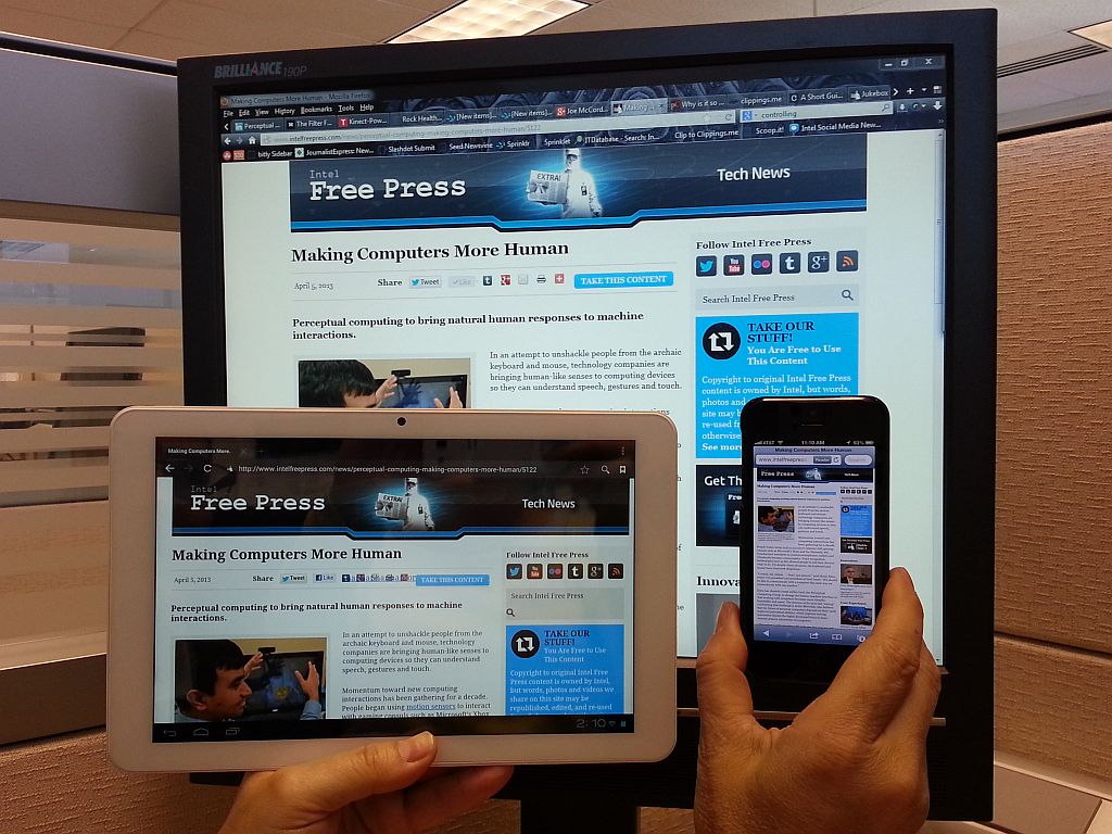
| Responsive layout | A page that adapts to different screen sizes and devices | Social visitors often arrive on phones, not desktop monitors |
That vocabulary is useful because most social design mistakes are not dramatic. They are ordinary: a preview image crops badly, a feed pulls too much attention, or a share button takes over a page that should be doing actual work. Small errors, large irritation. The usual web story.
How social media changes user behavior
Social media affects design because it changes context. A visitor from search often arrives with a specific question. A visitor from social often arrives with curiosity, momentum, or a half-formed opinion. They may have clicked because a friend shared the page, because the image looked useful, or because the headline promised something worth a glance. That means the website has to earn the next ten seconds, not just the next sale.
In practice, this changes three things. First, the page has to open with clearer cues. Second, the design has to survive mobile first. Third, the site has to feel trustworthy enough that the visitor is willing to slow down. Social traffic is usually impatient in a slightly different way than search traffic. It is not better or worse. It is just shaped by a different habit.
Pew Research Center’s social media fact sheet is helpful here because it shows how normal social platforms are for many internet users. If a large share of your audience already spends time inside social apps, the website cannot assume a patient, desktop-only reading pattern. The page has to meet people where they already are.
| Observed behavior | Design implication | What to do |
|---|---|---|
| People scan before they read | The opening view needs a clear headline and a visible next step | Keep the hero section simple and direct |
| Visitors arrive from phones | The layout has to work on a small screen without pinching or horizontal scroll | Test the page on mobile first, not after the layout is already crowded |
| Shares happen fast | The preview needs to make sense out of context | Use clean metadata, strong images, and concise titles |
| Trust is visual and immediate | People judge the site from the first screenful | Use spacing, contrast, and a calm hierarchy instead of clutter |
One practical lesson follows from that table: the website does not need to imitate social media to benefit from it. It needs to be prepared for social behavior. That is a different job.
When social feedback also needs to move into a shared inbox, CRM, or approval queue, it can help to connect AI to your existing workflow before the process gets messy; a neutral overview of that kind of setup appears in AI integration services.
Designing for social sharing
Sharing works best when the page is designed to survive being seen out of context. A person may share your home page, a service page, a blog post, or a portfolio piece. In each case, the preview has to explain the page before the click happens. That is where share cards and metadata do real work.
For the technical side of that job, the Open Graph protocol gives social platforms a common way to read the title, description, and image of a page. If you want the clean version of the workflow, this is the place to start. The same page can also be supported with the social-sharing guidance from Meta’s webmasters docs, which explain how a page can present itself properly when shared.
That does not mean you should pack every page with social controls. It means you should make the content sharable without making the design noisy. A good share experience is usually invisible while the visitor is on the page and very visible after they leave it.
What a good share setup includes
- A clear page title that still makes sense out of context.
- A concise description that does not feel like keyword stuffing.
- A share image with enough contrast and breathing room to survive cropping.
- A URL structure that is readable and not full of nonsense parameters.
- A page layout that still works if the preview is the only thing people ever see.
The share image matters more than many teams expect. A good image does not need to be flashy. It needs to be legible. A page about web design may use a screenshot, a clean illustration, or a branded visual that makes sense at thumbnail size. A tiny image with crowded text is a common failure. It looks fine in the media library and then falls apart the moment a platform resizes it.
What to avoid
- Do not let the share card repeat the same generic homepage text on every page.
- Do not use a preview image that becomes unreadable when cropped to a square or landscape ratio.
- Do not let a social teaser promise more than the page can deliver.
- Do not place giant social icons in the hero just because a button set is available.
That last point sounds small, but it matters. A lot of sites treat social icons like decoration. They are not decoration. They are utility items. If they help the visitor share the page, they belong in the design. If they only compete with the message, they should be smaller or placed lower on the page.
Embedding social media feeds
Embeds are useful when the social content itself is part of the proof. A restaurant may use a current Instagram post to show a special. A conference site may embed a keynote announcement. A design studio may include a single testimonial post or a live example of work in the wild. In those cases, the embed adds freshness and credibility that static copy cannot always match.
But embeds also carry a cost. They add weight, they can slow the page, and they can turn a clean layout into a busy one if they are overused. I usually treat embeds as accent pieces, not the main argument. One strong embed can help. Three feeds stacked on top of each other usually cannot.
If you want to see the official route for this kind of integration, Meta’s embedded posts documentation shows how a single post can be placed on a page without rebuilding the whole site around it. That is the right model: a small, deliberate addition, not a second social network inside your homepage.
Use embeds when they answer a real question
- Use an embed when the visitor benefits from seeing a live update.
- Use an embed when the social post is the evidence, not just the decoration.
- Use an embed when a single post supports the page’s purpose better than a screenshot or summary would.
- Do not use an embed just because there is empty space.
That last line is the one I have to repeat most often. Empty space is not a design emergency. The temptation to fill every gap is how pages become noisy.
Performance and privacy still matter
Social embeds usually call in third-party scripts. That means the page has to manage performance, privacy expectations, and accessibility with more care than a simple image. If the embedded content is slow, the page feels slow. If the embed blocks the main layout, the page becomes frustrating. If the embed is inaccessible, it creates a barrier for people using assistive tools.
That is why I like a simple rule: if the page works better without the feed, leave the feed out. You can still link to the social profile in a controlled way, or show selected posts manually, or use a single embed on a page where the feed truly supports the message.
Best practices for social integration
Once the sharing and embedding decisions are clear, the remaining work is mostly discipline. Social features are easy to add and easy to abuse. The goal is not to show everything. The goal is to show the right thing in the right place.
I usually return to four questions: Does this help the visitor? Does it stay readable on mobile? Does it load cleanly? And does it still feel like the website, not the social network?
| Best practice | Why it helps | Practical next step |
|---|---|---|
| Keep social actions visible but restrained | Visitors can share without feeling pushed | Place share buttons near useful content, not everywhere |
| Use a consistent preview image style | The brand looks organized across platforms | Create one or two image templates that crop well |
| Protect page speed | Social traffic will not wait long for a heavy page | Limit embeds, compress images, and avoid unnecessary scripts |
| Keep the site responsive | Most shares now land on phones first | Review the layout at mobile widths before adding more content |
| Make social content accessible | More people can use the page without friction | Use alt text, captions, and keyboard-friendly controls |
| Moderate user-generated content | Real proof is helpful; junk is not | Approve or curate content before it appears on the page |
The responsive part is worth underlining. A social post may look polished on a desktop monitor, but the shared link lands on a phone just as often. That is why Google keeps emphasizing responsive design: the landing page has to adjust to the device that actually opens it. If you want the technical background, Google Search Central’s responsive design guidance is still the cleanest summary.
If your site needs broader help turning those choices into a stable layout, our web design services cover the practical side of page structure, mobile behavior, and content organization. If you want more examples of how these decisions play out on real sites, the blog index is a good place to keep reading.
Two examples that hold up in practice
I prefer examples over theory because social integration decisions are easier to judge when you can see the tradeoff. These are not dramatic case studies. They are the kinds of situations that come up on real business sites.
1. A service business sharing one strong proof point
A local service business may not need a live social feed on every page. What it usually needs is one useful proof point: a recent post showing a finished project, a testimonial graphic, or a short announcement that confirms the business is active. In that case, a single social embed or a carefully chosen share image can help without taking over the layout.
The design lesson is simple. Keep the social proof near the relevant content and let the page do the rest. Do not turn the homepage into a scrolling wall of posts. The visitor came for a service, not a feed.
2. A campaign or event page with a clear sharing path
A campaign page is a different story. If the goal is to spread an event, a sale, a launch, or a community announcement, then the share card becomes central. A clear title, a strong preview image, and a concise summary help the page travel well across platforms. In that situation, social sharing is not an accessory. It is part of the distribution plan.
The page should still be usable without the share buttons in front of the visitor’s face every five seconds. But the content itself should be prepared to move cleanly from one platform to another. That is what good social design looks like: calm on the page, effective outside it.
If you want a concise source for the preview side of that workflow, the Open Graph documentation linked above is the technical starting point. If you want the user-behavior side, Pew’s social media research is a good reminder that the audience already knows these platforms well. The site does not need to explain the network. It needs to present the page clearly.
A short checklist before you publish
When I review a page that includes social features, I use a short checklist. It keeps the decision from drifting into taste tests and logo arguments.
- Does the page still load quickly on mobile?
- Does the share preview make sense without extra explanation?
- Are the social buttons helpful rather than noisy?
- Does any embedded content support the page’s purpose?
- Can a keyboard user reach the social controls?
- Does the page still read clearly if the social content is blocked?
That last question is the one that saves the most trouble. A page should still work if the social widget is delayed, unavailable, or ignored. If the whole layout collapses without the widget, the widget is too important and the page is too fragile.
Conclusion
Social media influences web design because it changes the conditions under which a website is first seen. The visitor may arrive on a phone, from a quick share, with little patience and no context. That means the page has to be readable, responsive, and trustworthy right away. It also means social features should be used with restraint. A good website does not need to imitate a feed to benefit from social traffic.
When I strip the subject down to its practical core, the question is simple: does this social feature help the visitor understand, trust, or share the page without making the page harder to use? If the answer is yes, keep it. If the answer is no, remove it or reduce it. That is usually the cleanest decision.
Key points to remember:
- Social media changes how visitors arrive, skim, and decide.
- Share cards and Open Graph metadata matter because they shape the first impression before the click.
- Embeds are useful when they add proof or context, but they should stay limited.
- Responsive design is still the safest default because social traffic is usually mobile first.
- Accessibility, performance, and moderation matter just as much as visual polish.
If your current site feels cluttered, slow, or hard to share, start with the basics: simplify the preview, limit the embeds, and check the layout on a phone before adding anything else. If you want help turning that into a practical update plan, request a quote today. If you want more guidance first, the services page explains how CBass Web Design approaches site improvements with mobile behavior and everyday usability in mind.