The Importance of Responsive Design for Your Website
Written by June Park | Updated June 8, 2026
Responsive design is the quiet stage crew of a good website: if it does its job well, nobody notices the rigging, and everybody enjoys the show.
If you found this article, you are probably circling a few practical questions:
- What exactly makes a website “responsive” instead of merely “shrunk down”?
- Why do some sites feel effortless on a phone while others feel like they were packed into a sandwich bag?
- Does responsive design really affect search visibility, or is that just web-design folklore in a nicer blazer?
- What should a business owner or site manager actually fix first?
Jeffrey Zeldman said design without content is decoration. Responsive design pushes that idea one step further: a site that only works well on one screen is only half-designed. Guidance from MDN’s responsive design documentation and web.dev’s responsive design basics both point to the same reality. Modern websites need layouts, typography, media, and interactions that can adapt instead of crack under pressure.
That matters because visitors do not arrive in a neat little parade of identical laptops. They show up on phones in parking lots, tablets on couches, desktops in offices, and sometimes on a screen so wide it feels like it could host a small weather system. By the end of this article, you will know what responsive design is, why it matters for user experience and SEO, and which best practices help a website stay readable, usable, and persuasive across devices.
What is responsive design?
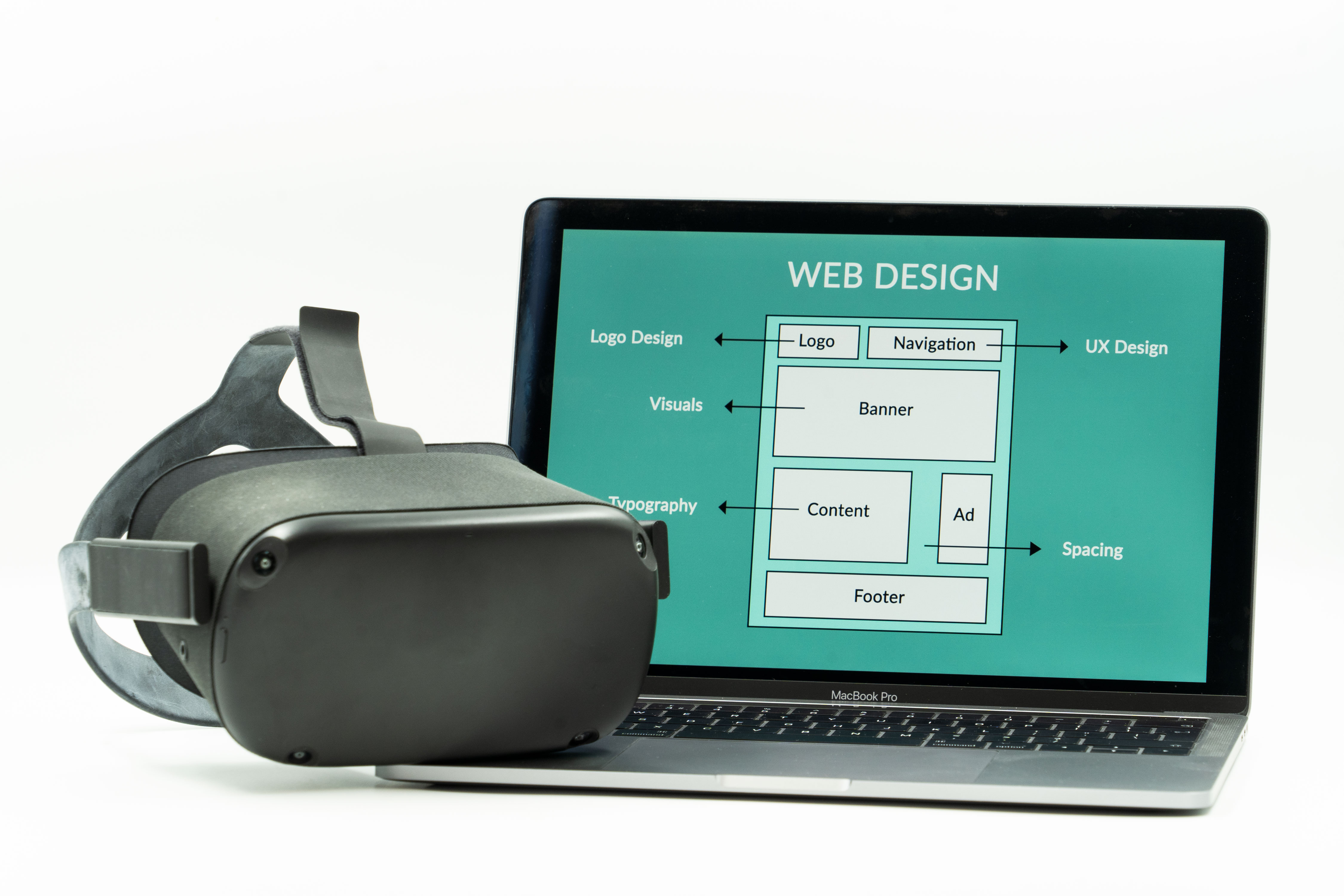
Responsive design is an approach to building websites that allows one site to adapt gracefully to different screen sizes, orientations, and device capabilities. Instead of creating a separate “desktop site” and “mobile site,” responsive design uses flexible layouts, scalable images, and CSS rules that respond to the available screen space.
Think of it like a good host at a dinner party. If three guests arrive, the table feels comfortable. If ten guests arrive, the chairs get rearranged, the serving dishes move, and nobody ends up eating from the windowsill. The meal is still the meal. The setup adjusts to the room.
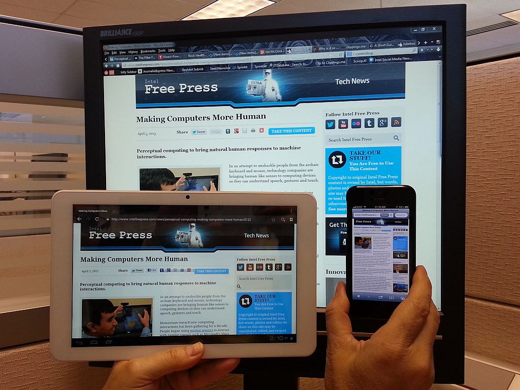
On the web, the “room” is the screen. A responsive homepage may display three columns on a laptop, two columns on a tablet, and one clean column on a phone. Navigation may shift from a full menu bar to a simpler stacked menu. Images may scale down. Buttons may become larger and easier to tap. Headings may wrap differently so they still look intentional instead of like they lost a fight with the margins.
Historically, plenty of older sites were built with fixed-width layouts. They looked fine on the screen size they were designed for and grumpy everywhere else. Then phones became the default internet machine for millions of people, and fixed-width layouts started showing their age fast. Tiny text, clipped forms, microscopic links, sideways scrolling, and “pinch to zoom” gymnastics became the digital equivalent of asking visitors to read the menu through a keyhole.
Responsive design changed that. Instead of asking the visitor to adapt to the website, it asks the website to adapt to the visitor. That is the whole philosophy in one sentence, and it is still one of the healthiest rules in web design.
Why responsive design matters now
The web is no longer a desktop-first place with a mobile side entrance. It is a mixed-device environment where the first visit, the second visit, and the conversion may all happen on different screens. A person might discover a business on a phone, compare services later on a tablet, and send an inquiry from a desktop. If the experience feels broken at any stage, the relationship gets shaky.
Responsive design protects continuity. It keeps the same business story, offer, and call to action coherent wherever the visitor lands. That matters for local service companies, nonprofits, ministries, ecommerce shops, consultants, and basically anyone who would rather not lose trust because a button fell off the page.
It also keeps teams from maintaining duplicate versions of the same content. Separate desktop and mobile experiences may sound tidy in theory, but in practice they often become a maintenance tax. Every update now has two chances to drift, contradict itself, or simply get forgotten. Responsive design reduces that chaos by giving you one content system and one core experience that can flex.
If you want a quick test, open your website on your phone and ask four brutally fair questions:
- Can I understand what this business does within five seconds?
- Can I read the text without zooming?
- Can I tap the main navigation or call-to-action button without precision surgery?
- Can I complete the next step, such as calling, booking, or filling out a form, without annoyance?
If the answer to any of those is “sort of,” responsive design deserves your attention.
Benefits of responsive design
Responsive design is not just a visual upgrade. It changes how well a site performs as a business tool.
1. Better user experience
The most obvious benefit is usability. Visitors can read the content, find the navigation, and interact with the page without friction. When a site feels easy to use, people stay longer, absorb more, and are more willing to trust what they are reading.
A responsive design pays attention to the little things that feel tiny until they are suddenly not tiny at all: line length, button size, spacing between links, menu behavior, image scaling, and form fields that do not require a stylus and a prayer.
2. More effective mobile traffic
Mobile traffic is only useful if mobile visitors can do something productive once they arrive. A beautifully designed desktop page that turns into chaos on a phone is like putting a polished front door on a building with no floor behind it.
Responsive design helps convert attention into action. That action might be a call, a contact form, a donation, a product inquiry, or a newsletter signup. Whatever the next step is, it has a better chance when the path does not feel like an obstacle course.
3. Lower maintenance overhead
One responsive site is usually easier to maintain than multiple versions built for different devices. Content updates, design adjustments, and accessibility improvements can be made in one system instead of copied and checked in several places. That saves time and reduces inconsistency.
For small businesses especially, that matters. Fewer moving parts means fewer opportunities for old prices, broken layouts, mismatched promotions, or contact details that mysteriously differ depending on whether the visitor arrived by thumb or mouse.
4. Stronger brand consistency
A responsive site keeps your voice and visual identity coherent across screens. The logo, colors, photography, and core messaging still feel like the same business. That sounds obvious, but consistency is one of the ways visitors decide whether a site feels established or improvised.
When a page collapses badly on mobile, the brand can start to look less careful than it really is. Good responsive design prevents that accidental reputational damage.
How responsive design affects user experience
User experience is where responsive design stops being theory and starts behaving like money, trust, and momentum.
Seamless navigation across devices
Navigation should adapt, not disappear. On a larger screen, that may mean a clear top-level menu with visible pathways to services, support, and contact information. On a smaller screen, it may mean a compact menu button, a sticky call button, or a simplified structure that keeps the important paths obvious.
Imagine a visitor looking for help on a plumbing site during a small household catastrophe. They do not want a mystery novel. They want the phone number, service area, and next step. Responsive design reduces interface friction so urgency does not turn into abandonment.
Faster perceived loading and clearer focus
Responsive design and performance are not identical, but they are close cousins that borrow each other’s tools. Cleaner layouts, appropriately sized images, and a more disciplined content hierarchy help pages feel faster and easier to process. Even when the raw speed difference is modest, a focused layout creates the sense that the site is under control.
That sense matters. People are remarkably good at sensing when a page is wasting their time, even before they could explain why.
Lower bounce risk
Visitors bounce when the page feels confusing, cramped, slow, or not worth the effort. Responsive design cannot solve every bounce issue, but it removes a common category of self-inflicted damage. If a visitor leaves because the content was not a fit, that is one thing. If they leave because the menu was impossible and the text looked like it had been whisper-shrunk, that is avoidable.
More confidence during key actions
Forms, checkout flows, booking widgets, and contact steps all feel higher-stakes on mobile because the screen is smaller and the user is often distracted. A responsive form uses readable labels, sensible spacing, correct input types, and buttons that are easy to tap. It respects the reality of a mobile visitor who may be standing in line, holding coffee, and making decisions with one thumb and limited patience.
That is not a niche scenario. That is Tuesday.
SEO implications of responsive design
Search optimization and responsive design are not the same thing, but they shake hands constantly.
Responsive design supports SEO because search engines want to send users to pages that work well on the devices they are actually using. If your site is difficult to use on a phone, the user experience signals around that visit can suffer, and the page may struggle to perform as well as it could.
Mobile-first expectations
Search engines evaluate modern websites in a mobile-aware way because that reflects how people browse. If your mobile experience hides important content, buries navigation, or breaks layout logic, that is not just a design problem. It becomes a discoverability problem too.
This does not mean a responsive layout alone will launch a page to the top of search results like a confetti cannon. You still need helpful content, clear structure, internal linking, and a technically sound site. But responsive design removes a major source of friction that can undercut all of those other efforts.
User engagement metrics are downstream design signals
When a page is easy to use, visitors are more likely to keep reading, move to another page, or complete a task. When it is difficult to use, they are more likely to leave. Search performance is influenced by many factors, but it is hard to build strong organic visibility on top of a page experience that annoys the audience on arrival.
That is one reason responsive design pairs well with thoughtful internal linking. A visitor who enjoys the first page is more likely to explore your services page, browse the rest of your blog, or reach out for help instead of bouncing back to search results.
Content parity matters
One of the quiet advantages of responsive design is that it encourages content parity across devices. The same essential information is available whether the visitor arrives on mobile or desktop. That consistency helps both users and search engines understand the page clearly.
If your mobile version trims out important headings, calls to action, or trust-building details, the site may look simpler while actually becoming less persuasive. Responsive design is stronger when it simplifies the presentation without shrinking the value.
Real-world examples of responsive thinking
It helps to move from abstract rules to concrete situations.
A local service business
A roofing contractor’s site may get a large share of first visits from phones, especially after storms or urgent home issues. A responsive version of that site keeps the phone number visible, uses large tap targets, and moves proof elements like reviews and service highlights near the top. The visitor can understand the offer quickly and act fast.
A nonprofit donation page
A nonprofit may earn support from people who first encounter a campaign through email or social media on mobile. Responsive design keeps the story readable, the donation form manageable, and the calls to action clear. Fewer layout surprises means fewer opportunities for goodwill to evaporate right before someone was ready to help.
A restaurant website
Restaurants live in the land of immediate intent. People want the menu, hours, location, and reservation path now, not after solving a tiny interface escape room. A responsive site prioritizes those actions with readable menus, tap-friendly buttons, and a layout that does not force sideways scrolling while someone is trying to decide whether tacos are the move.
An established company refreshing an older site
Many redesign projects are not about chasing trends. They are about removing friction from a site that still has good bones. In those cases, responsive work may focus on typography, spacing, navigation, image handling, and forms rather than reinventing the entire brand. That kind of cleanup can produce a big practical improvement without dramatic visual theatrics.
If you are comparing website approaches more broadly, a useful side read is Flatlogic’s article on Are AI Web Builders Becoming the New Website Templates?, which looks at how newer build approaches compare with traditional template thinking.
Best practices for responsive design
Here is the boring magic. These are the habits that make responsive sites hold together when screens, browsers, and content lengths start behaving like free-range goats.
Use fluid grids
Build layouts with relative sizing instead of rigid fixed widths wherever practical. Fluid grids let sections grow and shrink based on available space. That gives the design flexibility instead of forcing it into one exact screen width and hoping the internet remains perfectly cooperative.
Make images flexible
Images should scale within their containers and avoid breaking the layout. Large decorative images may crop differently across devices, while informative images need enough space to remain useful. If an image contains essential detail, test it carefully on smaller screens. If it becomes unreadable, the content probably belongs in HTML rather than inside the image.
Use media queries with purpose
Media queries are the CSS rules that let a design adjust at different breakpoints. The goal is not to collect breakpoints like trophies. The goal is to support the content. Add layout changes where the design genuinely starts to strain, not because a random template declared a sacred device width in 2016 and nobody challenged it.
Design for touch, not just cursors
Hover states are nice. Fingers, however, do not hover. Make buttons large enough to tap, leave space between interactive elements, and keep forms simple. A responsive site should feel natural for touch interaction, not merely survivable.
Test on real devices
Browser tools are helpful, but there is no substitute for opening the site on actual phones and tablets. Check the homepage, key landing pages, forms, menus, and any conversion-heavy pages. Real-world testing catches the weird little issues that screenshots miss: sticky elements covering buttons, fields that trigger the wrong keyboard, or text blocks that suddenly become comedy-length on mobile.
Keep the content hierarchy honest
Responsive design is not just layout engineering. It is content prioritization. Decide what matters most on smaller screens and bring those elements forward. That usually means concise headings, clear benefits, visible calls to action, and enough white space that the page can breathe.
A practical responsive design checklist
| Area | What to check | Why it matters |
|---|---|---|
| Typography | Readable text size, sane line length, strong contrast | Visitors can read without zooming or squinting like they are decoding a treasure map |
| Navigation | Menus are clear, important links stay visible, tap targets are large enough | People can find the next step instead of wandering around the interface woods |
| Images | Images resize cleanly and do not overwhelm the layout | Visuals support the message instead of blowing holes in the page structure |
| Forms | Fields are easy to complete on mobile and labels remain visible | High-intent visitors can convert without frustration |
| Performance | Pages load cleanly, especially key landing and contact pages | Speed and clarity reduce abandonment |
| Content priority | Key value proposition and CTA appear early on small screens | The page communicates before the visitor loses interest |
What to do next if your site is not responsive yet
Do not panic and rebuild everything by sunset. Start with the pages that matter most:
- Your homepage
- Your main services or sales pages
- Your contact page or lead form
- Your most-visited blog or resource pages
Open those pages on a phone. Take notes. Where do people hesitate? What becomes hard to read? Which buttons feel too small? Which sections push the real point too far down the page? Those observations will usually tell you more than ten abstract design debates.
If you want a second set of eyes, our web design services page explains the kind of practical improvements that help remove mobile friction, and the blog index collects additional website planning articles as the resource library grows.
Conclusion
Responsive design matters because the modern web is not visited from one screen, one mood, or one context. People browse while moving, waiting, comparing, multitasking, and deciding. A site that adapts to those realities is easier to use, easier to trust, and easier to find.
Key takeaways:
- Responsive design adapts layouts, media, and interactions to different screens.
- It improves user experience by making websites easier to read, navigate, and use on mobile devices.
- It supports SEO by strengthening the mobile experience and reducing user friction.
- Best practices include fluid grids, flexible images, purposeful media queries, and real device testing.
A responsive website is not flashy by default, and that is fine. Good infrastructure rarely gets applause. It gets results. Try this once: review your site on your phone as if you were a first-time visitor with limited time. The friction you feel is your next design to-do list, and fixing it is often less glamorous than a redesign pitch deck but far more useful.