The Impact of Color Psychology on Web Design
Color is the first tiny decision that starts a conversation with your visitor. Before anyone reads a headline, scans a CTA, or decides whether your page feels trustworthy, the color palette has already made a quiet introduction. Sometimes it is a warm handshake. Sometimes it is a neon alarm bell. Either way, the page has spoken.
If you have ever asked yourself, Why does this page feel calm while that one feels pushy? Why does one button get clicked and another disappear into the wallpaper? Why does a brand feel expensive in one palette and bargain-bin in another? you are already asking the right questions. Color does not work like magic, but it does work like a very persuasive stage manager: it moves attention, sets mood, and points people toward the next useful action. Adobe’s color theory guide and the W3C’s contrast guidance both make the same basic point from different angles: color is not decoration, it is function.
That matters because color affects more than taste. It changes how quickly people scan a page, what they notice first, what feels clickable, and whether the site feels easy enough to trust. Google’s Material Design color guidance and the W3C accessibility standards both treat color as part of the interface, not a decorative garnish. That is the practical reason to care. A thoughtful palette can help a site feel calmer, clearer, and more credible. A careless one can make even a good business look like it was designed during a caffeine emergency.
In this article, I will walk through what color psychology actually means, how color influences behavior, how to choose a palette for a brand, what effective real-world color systems look like, and how to test whether a palette is doing its job. If you want the short version, here it is: color should support the message, not wrestle it to the floor.
By June Park
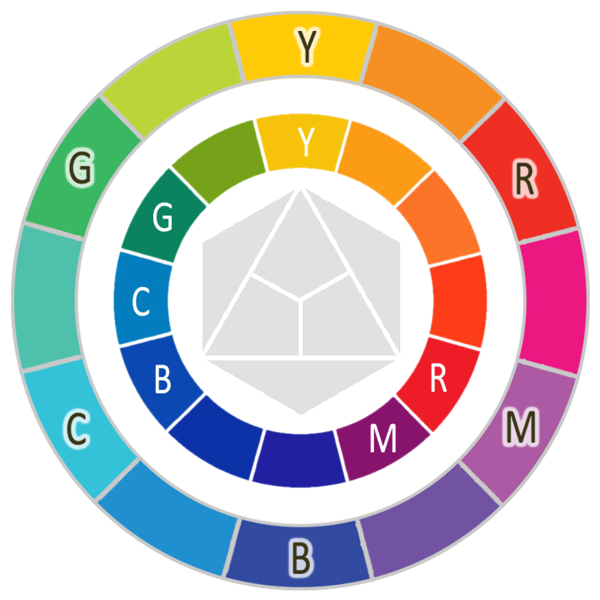
What color psychology actually means
Color psychology is the study of how people tend to react to colors emotionally, cognitively, and behaviorally. That sounds grand until you realize the practical version is much simpler: certain colors often feel warmer, cooler, safer, sharper, friendlier, or more urgent depending on context. A website designer uses that effect to support a business goal, not to collect style points from the universe.
The important word there is tend. Color psychology is not a fixed law of human nature. It is a pattern of associations shaped by culture, industry, personal experience, lighting, contrast, and context. Red can suggest urgency, passion, or danger. Blue can suggest calm, reliability, or a very polite corporate elevator. Green can suggest growth, nature, or a checkout screen that is trying to reassure you. Same hue, different room, different effect.
That is why color should be treated like a language with accents. You can understand the broad meaning without pretending every audience hears the exact same thing. A good designer listens for the message first and then chooses color to reinforce it. If the site is meant to feel grounded, the palette should not look like a candy store got into a fight with a discount neon sign.
Terms worth knowing
| Term | Plain meaning | Why it matters in web design |
|---|---|---|
| Hue | The color family itself, such as blue, red, or green | Sets the broad mood of the palette |
| Saturation | How intense or muted a color appears | Shapes whether the design feels soft or loud |
| Value / lightness | How light or dark a color is | Affects contrast, readability, and visual weight |
| Contrast | The difference between two colors | Decides whether text and controls are easy to see |
| Palette | The full set of colors used in a system | Creates consistency across the site |
| Accent color | A color reserved for emphasis, like buttons or links | Helps important actions stand out without chaos |
Those terms matter because design decisions get much easier when the language is clear. If someone says, “Make it more energetic,” that does not mean “turn the whole site into a firework.” It may mean increasing saturation in one accent color, or using warmer hues for calls to action while keeping the background calm. Tiny distinction, big difference.
How colors influence behavior
Color influences behavior in a few useful ways. First, it directs attention. Human eyes are drawn to contrast, brightness, and unexpected color changes. If everything is loud, nothing is loud. That is why a single accent button can outperform a page full of competing colors. The right color gives visitors a mental shortcut. They do not have to think as hard about where to go next.
Second, color affects trust. People may not consciously say, “This blue feels dependable,” but they absolutely feel whether a page is stable, professional, and easy to read. In interfaces, trust often comes from restraint. A controlled palette looks intentional. A random one looks like the site had no adult supervision.
Third, color can influence urgency. Bright warm colors often move faster in the visual field than softer cool colors. That makes them useful for limited offers, alerts, and primary actions. But urgency is a spice, not a soup. If every button shouts, visitors stop listening. The page becomes a town square where everyone is selling the same sandwich.
Fourth, color supports memory and recognition. A strong palette makes a brand easier to recognize across pages, emails, ads, and social posts. That consistency matters because repeated visual cues build familiarity. Familiarity helps people remember you, and memory helps them come back when they are ready to buy, book, or ask for help.
Fifth, color can make interfaces easier or harder to use. That is where accessibility stops being a side topic and becomes core design. A beautiful palette that hides text or makes buttons hard to distinguish is not really beautiful; it is just expensive confusion. W3C’s non-text contrast guidance is useful here because icons, focus states, borders, and controls need enough contrast to be seen, not just admired.
Common emotional associations, with a big asterisk
| Color family | Common association | Works well for | Watch out for |
|---|---|---|---|
| Blue | Calm, trust, reliability | Professional services, finance, healthcare, tech | Can feel cold or generic if overused |
| Red | Urgency, energy, passion | Promotions, alerts, high-attention calls to action | Can feel aggressive if it dominates the page |
| Green | Growth, balance, nature | Environmental brands, success states, finance | Can become visually sleepy if too muted |
| Yellow | Optimism, warmth, visibility | Highlights, small accents, youthful brands | Low contrast yellow is easy to misuse |
| Black / charcoal | Authority, luxury, focus | Premium brands, editorial layouts, minimalist designs | Can look heavy if the page lacks breathing room |
| White / neutrals | Clarity, space, cleanliness | Readable layouts, modern portfolios, service pages | Too much white without contrast can feel unfinished |
The asterisk matters. Color meaning is not a vending machine where you press blue and get trust. The same hue can feel different depending on saturation, surrounding colors, typography, imagery, and audience expectations. That is why good designers test reactions in context instead of trusting a color-meaning infographic like it is sacred scripture.
Choosing colors for your brand
When I help think through a brand palette, I start with the business story, not the color wheel. A palette should express what the business promises: calm, speed, precision, warmth, expertise, or a mix of those. If the offer is thoughtful and personal, the color system should not feel frantic. If the service is fast and high-energy, the palette should not look like it was left in the rain and is now emotionally unavailable.
1. Start with the brand promise
Ask what the visitor should feel in the first five seconds. Safe? Curious? Energized? Relaxed? Confident? Those words are much more useful than “modern,” because modern can mean almost anything and usually means “please stop asking me to explain it.” Once the emotional target is clear, choose colors that support it.
For example, a law firm may want steadiness and clarity, which often points toward restrained blues, grays, and a single confident accent. A children’s brand may want playfulness, which can handle brighter saturation and more contrast. A local service business may want approachable professionalism, which often works best with warm neutrals, a clear accent color, and not too many competing tones.
2. Pick one dominant emotion
Most effective palettes do not try to express everything at once. They lead with one dominant feeling and use the other colors to support it. That one choice keeps the visual system coherent. A site can be warm and reliable, or elegant and energetic, or simple and optimistic. It usually cannot be all four at full volume without becoming a design casserole.
A good rule is to choose one primary emotional job for the palette and one backup job for the accent color. If the main color says “trust,” the accent might say “action.” If the main color says “calm,” the accent might say “focus.” That division of labor keeps the page from arguing with itself.
3. Build the palette by role, not by preference
One of the fastest ways to make a palette work is to assign each color a job. This avoids the common trap of choosing colors because they look nice individually but fail miserably together. A design system is a team, not a talent show.
| Role | Suggested color behavior | Example use |
|---|---|---|
| Primary color | Most recognizable brand color | Header accents, main buttons, links, highlights |
| Secondary color | Supports the primary color without competing | Subsections, badges, informational graphics |
| Neutral base | Quiet background and text support | Page backgrounds, cards, body text, borders |
| Accent color | Reserved for the most important action | Call-to-action buttons, forms, alerts |
| Success / warning / error colors | Functional colors with clear meanings | Status messages, forms, dashboards, alerts |
The easiest palette to use is usually the one with the fewest arguments. The color system should make choices obvious, not invite a monthly committee meeting with a new mood board every time someone opens Photoshop.
4. Keep contrast and accessibility in the room
This is where style gets serious. A palette that looks elegant but fails contrast checks is not finished. It is only visually confident. The W3C’s contrast standard exists because text must be readable for actual humans on actual screens, including small phones in less-than-ideal lighting. That means color choices have to support legibility, not just vibes.
If you want a practical companion to contrast testing, Google’s Material Design color overview is a useful model because it shows how color can define hierarchy without turning the interface into a rainbow traffic accident. The best systems reserve the boldest colors for the most important moments.
In practice, that means checking:
- Text against background
- Button labels against button fills
- Icon and outline visibility
- Focus states for keyboard users
- Color differences on mobile screens outdoors and indoors
5. Resist the copy-the-competitor reflex
Copying a competitor’s palette is tempting because it feels safe. But a safe imitation often erases the very thing that should make a brand memorable. If your market is full of blue-and-gray sites, that does not automatically mean you need a blue-and-gray site. It means you need a palette that is still trustworthy but more distinct. Otherwise your brand becomes one more beige jacket in a room full of beige jackets.
There is nothing wrong with learning from a competitor. There is something wrong with acting like their style came with a rental agreement for your business too.
If the brand voice and visual direction need to be translated into a full website system, the Services page is the logical place to start that conversation. Color is one part of the job, but on a real website it has to work with layout, typography, content, and calls to action. The palette is the drummer, not the whole band.
Examples of effective color use
The strongest color systems are usually the quietest about their own effort. They do not scream “Look at me, I am doing design!” They simply make the interface easier to understand. Two design systems that do this especially well are Material Design and the GOV.UK design system.
Material Design: color as structure
Material Design’s color overview treats color as a structured system for hierarchy, states, and emphasis. It is useful because it shows how color can support navigation and interaction without forcing every component to compete for attention. The lesson here is not “use teal because Google said so.” The lesson is that color should map to function.
That approach works because users learn the system quickly. Primary actions look primary. Secondary actions stay secondary. Surface colors support content. Error states look different from success states. The palette reduces interpretation work, and anything that reduces interpretation work usually improves the experience.
GOV.UK: restraint as a feature
The GOV.UK colour guidance is another strong example because it shows how a restrained palette can still feel clear, consistent, and authoritative. The design system uses color to support reading and task completion, not to decorate every corner of the page like a birthday cake with a project-management problem.
Its strength is discipline. One strong accent color can be enough when the rest of the system gives typography, spacing, and contrast enough room to do their jobs. That is an important reminder for small business sites: a memorable brand does not need fifteen colors. It needs a palette with a job description.
| System | What it gets right | Design lesson |
|---|---|---|
| Material Design | Functional hierarchy, clear states, strong system thinking | Color should support interaction, not distract from it |
| GOV.UK design system | Restraint, clarity, accessibility, and task focus | Fewer colors can create more confidence |
These examples also show a useful truth: effective color use is usually boring in the best way. The right color system does not ask for applause. It quietly prevents confusion. That is excellent work for a design element that mostly wants to be ignored until the exact moment it matters.
Testing color effectiveness
Color choices should be tested, not just admired. A palette can look beautiful in a mockup and still underperform once real visitors arrive. The proof lives in behavior: clicks, time on page, form completion, scroll depth, support questions, and direct feedback. Color is part art, part measurement.
1. Test one change at a time
If you change everything at once, you will not know what actually helped. Compare one button color against another, one background treatment against another, or one accent strategy against another. Keep the variable small enough that the result can teach you something useful. Otherwise you are not testing. You are just generating an opinion with charts.
2. Look at task completion, not just clicks
A bright button may attract clicks, but that does not automatically mean the page is working better. Maybe the color is too aggressive and people click by mistake. Maybe the button is easier to see, but the surrounding content is still confusing. The real question is whether the visitor completes the intended task more easily.
Use analytics, event tracking, and user sessions to see whether the color system helps people finish what they came to do. On a contact page, that could mean more successful submissions. On a product page, that could mean more add-to-cart actions. On a service page, that could mean more quote requests or more time spent reading the offer.
3. Ask actual humans
There is no substitute for asking people what they notice. A five-minute usability conversation can uncover whether the button blends in, whether the navigation feels obvious, or whether the accent color is pulling attention to the wrong place. People often tell you the problem in plain English if you are willing to listen and not immediately defend the palette like it is a family heirloom.
4. Check the design on real devices
Color behaves differently across screens. A subtle gray can disappear on an older phone. A bright accent can feel harsher in sunlight. A pastel that looked elegant on a desktop monitor can turn invisible on mobile. That is why the real test happens on real devices, not just in a tidy design file with ideal lighting and zero distractions.
Pay special attention to:
- Mobile readability
- Button visibility in bright light
- Link contrast in paragraphs and footers
- Form state colors for success and error messages
- How many colors the page uses before it starts feeling noisy
5. Prototype faster when needed
Sometimes the quickest way to test a color direction is to build a small prototype and compare versions before the site is fully committed. A web app generator can help teams stand up interface variations quickly when they need a practical test bed for layouts, dashboards, or workflow screens. The point is not to automate taste. The point is to remove friction from experimentation so the best option becomes obvious sooner.
That same mindset works for websites. When a team can make a few controlled variants, it becomes much easier to see whether the accent color is helping the CTA or shouting over the rest of the page like a toddler with a trumpet.
How to use color without overdoing it
The most common color mistake is not choosing the wrong emotion. It is choosing too many emotions at once. A site with one calm neutral base and one strong accent usually feels more confident than a site with six bright colors all trying to be the main character. Visitors are there to solve a problem, not to attend a color reunion.
Here is the practical rule I keep coming back to:
- Let the background stay quiet.
- Let the body text stay readable.
- Let the accent color do the heavy lifting on key actions.
- Let supporting colors stay in supporting roles.
- Let accessibility checks veto anything that looks stylish but reads like a prank.
That approach is simple enough for small sites and scalable enough for bigger systems. It also respects the fact that design is a service job. The palette exists to help people understand the content, trust the brand, and complete the next step. It is not a solo performance.
What to remember
Color psychology in web design is not about picking a “happy” color and hoping for the best. It is about using color to shape perception, reduce friction, and support the visitor’s next move. The most effective palettes are clear about their role, disciplined about contrast, and consistent across the site.
If you want the short version, remember these points:
- Color sets mood before words do.
- Color only works well in context.
- Contrast is not optional.
- One accent color can do more work than five competing ones.
- Testing beats guessing every time.
When you are ready to turn a color idea into a full website system, the next step is usually not another mood board. It is a conversation about goals, audience, and the pages that matter most. If that sounds useful, the Services page is the right place to start. And if you want more practical articles like this one, the Blog keeps the useful stuff in one place instead of scattering it across the internet like confetti with a navigation problem.
Color is a tool. Used well, it gives the site clarity, personality, and a little extra gravity. Used poorly, it becomes interface friction in its loudest outfit. The good news is that a better palette is rarely about more color. It is usually about better decisions.