Creating a User-Friendly Website: 7 Tips and Tricks
Written by Isla Bennett | Updated June 26, 2026
A user-friendly website does not feel simple because it has less on it. It feels simple because the visitor can always see what matters next.
If you are looking at your website and wondering whether it truly helps people, you are probably asking the right questions:
- Can a first-time visitor understand what this site does without hunting for clues?
- Is the main path obvious on desktop and on mobile?
- Do pages feel clear, calm, and readable, or do they feel like a puzzle with deadlines?
- What should be fixed first if time and budget are limited?
I start with a simple idea: people do not visit a website to admire its wiring. They visit because they want an answer, a service, a product, a phone number, a quote, or a next step that saves them time. That is why the usability heuristics from Nielsen Norman Group and the responsive design guidance in MDN’s responsive design documentation matter so much. Both point toward the same standard: useful websites reduce friction instead of creating it.
The subject is not decorative. A site that is hard to use on a phone, confusing to navigate, or vague about the next step can quietly lose leads long before anyone sends an email. The good news is that a user-friendly site is built from habits, not magic. By the end of this article, you will have a practical way to think about usability, a checklist for testing your own pages, and a clearer sense of what to improve first if you want better results from the site you already have.
What I mean by user-friendly
A user-friendly website is one that helps a visitor complete a task with as little confusion as possible. The task might be learning about your services, comparing options, finding pricing, checking hours, or getting in touch. The design does not have to be flashy. It does need to be clear.
That sounds obvious until you open enough sites and see how often the basics get tangled. A homepage may look polished but still hide the contact details. A service page may explain a business in beautiful language while never answering the practical question the reader came to solve. A mobile layout may compress neatly while turning every button into a guessing game. Usability usually fails in small places that add up.
| Term | Plain meaning | Why it matters |
|---|---|---|
| User experience | How it feels to use the site from start to finish | People judge trust and professionalism through the experience, not just the visuals |
| Usability | How easily someone can complete a task | Clearer tasks usually mean better engagement and more conversions |
| Navigation | The path a visitor uses to move through the site | Good navigation reduces wandering and helps people find the right page fast |
| Content hierarchy | The order in which information appears and how it is prioritized | Readers should see the most important message first, not after a long detour |
| Responsive layout | A design that adapts to different screen sizes | Many visitors now browse on phones first, so the mobile view matters immediately |
| Accessibility | The degree to which different people can use the site comfortably | Clear contrast, keyboard support, readable text, and sensible structure help more visitors succeed |
| Call to action | The next step you want the visitor to take | Every page should make that next step easy to recognize |
When I review a site, I like to ask one blunt question: if the visitor had only 10 seconds and one thumb, could they tell what to do next? That is not a technical benchmark, but it is a useful one. It cuts through design vanity and gets to the part that matters.
1. Start with the visitor’s job
The fastest way to improve a website is to stop designing from the business inward and start designing from the visitor outward. A visitor usually arrives with one job in mind. They are trying to compare services, check availability, verify that the business serves their area, read reviews, or request a quote. If the page does not answer that job quickly, the rest of the content has to work much harder.
For a local business in Klamath Falls, Oregon, that job may be very practical. Someone might want to know whether the business serves their neighborhood, whether the process is friendly, and how quickly they can expect a response. A user-friendly site answers those concerns early. It does not make people scroll through three screens of clever copy before they reach the basic facts.
One of the simplest ways to do this is to assign each page a single primary purpose.
- A homepage should explain the offer and guide the visitor to the right place.
- A services page should make the service menu easy to compare.
- A portfolio or case studies page should show proof without making the reader hunt for context.
- A contact page should make reaching out feel obvious and low-risk.
If a page tries to be the homepage, the brochure, the service catalog, the support desk, and the sales pitch all at once, it tends to become none of them. A visitor-friendly site resists that temptation. It gives each page a job and lets the structure do some of the work.
That is also why a clear internal link structure helps. A reader who is ready for more detail should be able to move naturally from the homepage to the services page and then to the blog if they want to keep learning. Good navigation respects the pace of the visitor instead of forcing a single path.
2. Make the main path obvious
The most important path on a website should be visible before the visitor has to think about it. If the site is built around quote requests, then the quote path should not be hidden three levels deep in a menu. If the site depends on calls, the phone number should not be treated like a secret. If the site is meant to educate, the next article or service link should be easy to find.
Good websites often feel calm because they remove choice overload. They do not show every possibility equally. They show the right possibility first. That is a quiet but powerful difference.
Here is a quick practical test:
- Open the homepage.
- Look away for a moment and then look back.
- Ask which action is most likely to help a first-time visitor.
- If the answer is not obvious, the design needs a stronger focal point.
That focal point may be a headline, a button, a short proof statement, or a short explanation of what problem the business solves. The format matters less than the clarity. The site should not make the reader decode its intentions.
A useful rule is to keep the primary action close to the primary message. If the page says “web design support for growing businesses,” the next step should be something like “view services,” “see examples,” or “request a quote.” The reader should not have to infer the path on their own.
If you are working with a more complex site, such as a business that has services, support, a portfolio, and several articles, use section headings and visible links to reduce drift. You do not need to force every visitor through the same corridor. You do need to keep the exits labeled.
3. Keep pages readable on a phone
Mobile usability deserves its own section because it is where many sites quietly lose the plot. A desktop page can tolerate a lot of visual clutter. A phone cannot. Small screens make weak choices obvious.
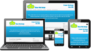
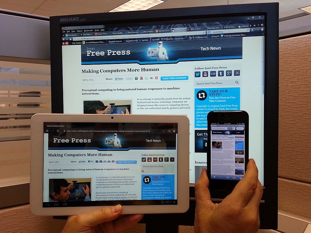
Responsive design is not simply about making everything smaller. It is about changing the layout so the content remains usable. That usually means adjusting column count, spacing, image scale, button size, and the order of information. The page should adapt to the device, not merely squeeze itself into it. MDN’s responsive design guidance explains the core idea well: flexible layouts, fluid media, and breakpoints are tools for matching the design to the available space.
When I check mobile readability, I look at four things first:
- Can I read the body text without zooming?
- Do headings clearly separate one idea from the next?
- Are buttons large enough to tap accurately?
- Does the layout keep the important content near the top?
The answer to those questions often reveals more than a long design debate ever could. A page that looks beautiful in a desktop mockup may be nearly unusable on a phone if the spacing collapses, the text is too small, or the calls to action disappear below the fold.
Google’s PageSpeed Insights is useful here because it gives you a quick reality check on how pages perform and where they need attention. Performance is not the same thing as usability, but the two are close enough that slow, heavy pages often feel harder to use as well.
Here are a few mobile-friendly habits that make a visible difference:
- Use one clear headline and one clear subheading before adding supporting copy.
- Keep forms short and make labels visible.
- Avoid huge hero sections that push everything useful far down the page.
- Use image sizes that support the layout instead of overpowering it.
- Make spacing generous enough that links do not crowd each other.
For local service businesses, this matters even more because many visitors are on the move when they search. They are not settling in for a long browsing session. They are trying to decide whether the site gives them enough confidence to take the next step. A mobile page that feels easy to use can make the difference between an inquiry and a quiet exit.
4. Use headings and language that reduce effort
Users read websites in a very specific way. They scan first, then slow down only if the page seems promising. That means headings are not decorative. They are landmarks. If the headings are vague, clever, or overly broad, the reader has to do the work of interpretation.
Compare these two sets of headings:
- “Our Story,” “What We Believe,” “A Different Kind of Service”
- “Services,” “How It Works,” “Examples,” “Request a Quote”
The first set may sound warm, but it is not always useful on its own. The second set helps the reader act. A user-friendly site does not ban personality. It simply keeps the personality from burying the practical value.
I also recommend writing in short, direct sentences when the site is trying to persuade or inform. That does not mean the copy has to be flat. It means the reader should not need to peel away layers of meaning to find the point. Clear language feels respectful because it saves time.
When you are editing page copy, ask these questions:
- Would a first-time visitor understand this sentence quickly?
- Does the heading describe the content that follows?
- Have I removed duplicate wording and filler?
- Do the verbs tell the visitor what happens next?
There is a quiet advantage to simple language: it scales well. If a business adds a new service, launches a new article, or updates a contact process, the copy still makes sense. Complicated wording tends to break under change. Plain language tends to survive it.
5. Make forms and buttons feel safe
A visitor should not feel punished for trying to contact you. Forms are often the moment where a user-friendly site either proves itself or exposes a crack. If the form is too long, the labels are unclear, the error messages are mysterious, or the submit button is hard to find, the visitor may give up right when they were ready to engage.
Good forms usually do a few simple things well:
- They ask only for the information needed right now.
- They keep labels visible instead of relying on memory.
- They use clear button text such as “Request a Quote” or “Send Message.”
- They explain what happens after submission.
- They show errors in plain language.
The same logic applies to buttons throughout the site. A button should tell the visitor what will happen when they click it. “Learn more,” “View services,” and “Get a quote” are easy to understand. Clever labels can slow people down or make them hesitate. Hesitation is expensive on a website.
This is one reason accessibility and usability overlap so strongly. The W3C Web Content Accessibility Guidelines emphasize contrast, structure, keyboard access, and perceivable content because those elements help more people use the site successfully. A page that is accessible in the practical sense is usually easier to use for everyone, not just for users with specific access needs.
If your contact or quote process is the main business goal, make that path visible in more than one place. The homepage can point to it. A service page can reinforce it. The contact page can keep the form simple and the expectations clear. People should not have to become detectives to start a conversation.
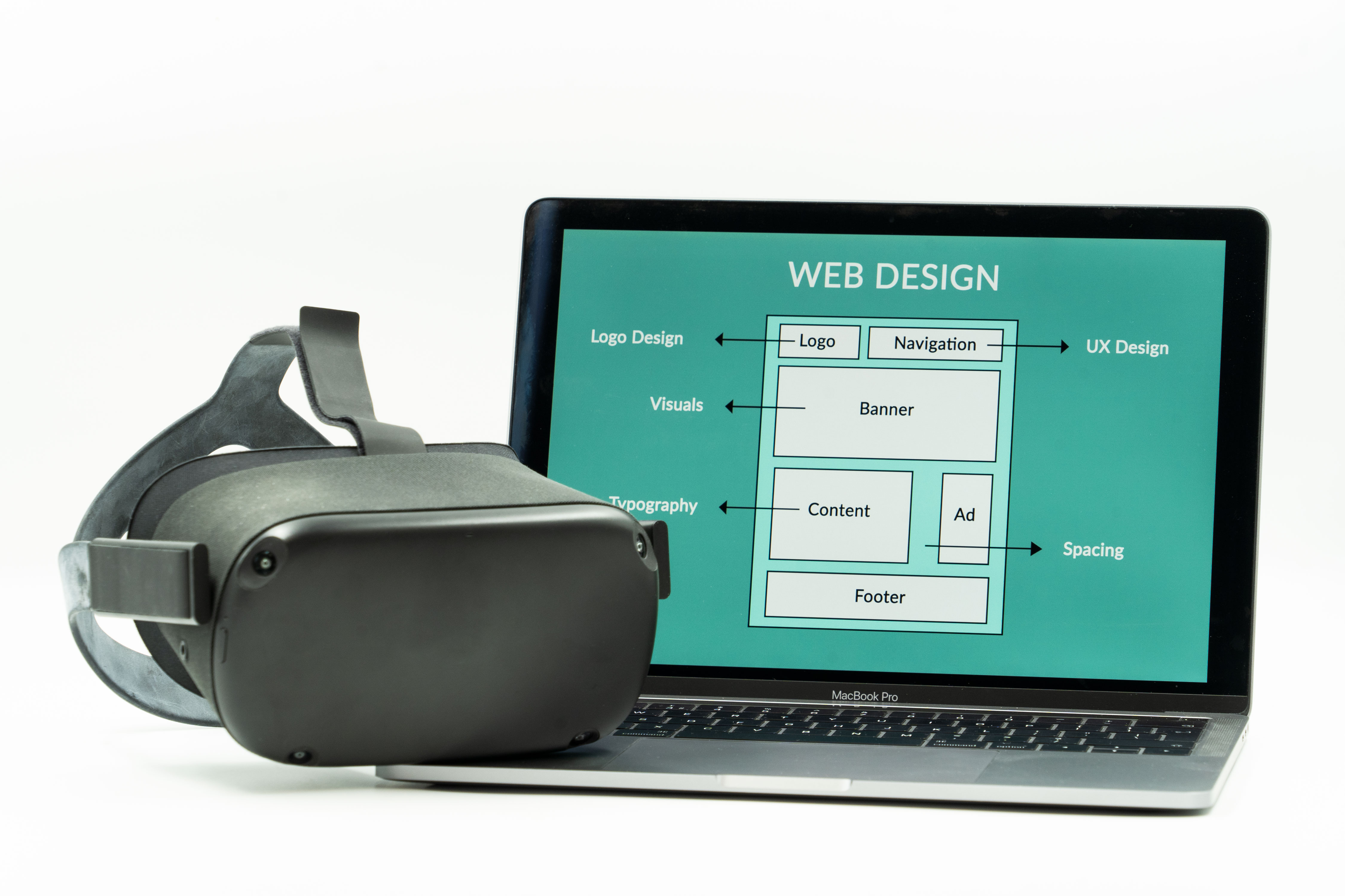
6. Let visuals support the message
Images help a website feel real, but they should earn their place. A user-friendly design uses visuals to clarify, reassure, or orient the visitor. It does not use them just to occupy space. A large photo with no purpose can slow the page and distract from the offer. A good visual, by contrast, can show context quickly and make a page feel more trustworthy.
That is why I like to choose images that support the section they appear beside. If the section is about responsive behavior, show a layout that changes across screens. If the section is about planning, show a workspace or process image. The image should behave like evidence, not wallpaper.
That principle matters for accessibility too. Every meaningful image should have useful alt text. Decorative images should stay decorative. If an image contains critical text, that text usually belongs in the page content instead, where it remains readable on mobile and screen readers can reach it without trouble.
When a page includes screenshots or photos, test them on smaller screens. A beautiful image can become less helpful if the crop removes the important part or the file is too large for mobile loading. Usability is full of moments like this: a small detail in one place can produce a bigger improvement than a dramatic change elsewhere.
7. Test the site like a visitor, not like the owner
Testing is where opinions become evidence. It does not have to be dramatic or expensive. You can learn a great deal by opening key pages on a few different devices and following a realistic task.
Try these test tasks:
- Find the main service offering from the homepage.
- Read a service page and identify the next step.
- Open the site on a phone and try to tap every important button.
- Complete a contact form without guessing what each field means.
- Use the blog index to find a helpful article in two clicks or fewer.
Those tests reveal whether the structure is helping or hiding. If the site requires too much hunting, the problem is usually not the visitor’s patience. It is the layout.
I also like to check a page against the classic usability heuristics from Nielsen Norman Group. For example, does the site keep users informed about what is happening? Does it match real-world language? Does it let the user control the pace? Those are old questions, which is usually a sign that they still matter.
For a second pass, compare the site against a checklist such as this:
| Check | What you are looking for | Why it matters |
|---|---|---|
| Headline clarity | The page says what it offers in plain language | Visitors should not have to guess the topic |
| Navigation | Menus and links lead somewhere useful fast | Good navigation lowers frustration |
| Mobile layout | Text, buttons, and images work on a small screen | Many visitors use phones first |
| Forms | Fields are short, understandable, and easy to submit | Forms are where interest becomes an inquiry |
| Proof | Reviews, examples, or process notes reduce uncertainty | People want reassurance before they commit |
| Performance | Pages load cleanly and do not feel heavy | Speed affects both attention and trust |
The point is not to find perfection. The point is to identify the few changes that would make the site feel immediately easier to use. That is where the best returns usually live.
8. Gather feedback without overcomplicating it
People who use a site every day can become blind to its friction. That is normal. A business owner knows where everything is because they put it there. A first-time visitor does not have that advantage. So the cleanest feedback often comes from someone who does not already know the layout.
You do not need a formal research program to get useful feedback. Start with a small, honest set of questions:
- What did you think this site offered at first glance?
- What was easy to find?
- What felt slower or more confusing than it should have?
- What would have made you more likely to contact the business?
If a visitor says the site feels “nice” but cannot tell you what action they should take next, that is useful feedback. If they can describe the offer but not the difference between services, that is useful too. Feedback does not have to be dramatic to be valuable.
A practical way to collect it is to pair informal feedback with a few data points. Look at the pages people visit most, where they drop off, and which pages drive inquiries. Then compare that with what actual readers say. The combination is usually more revealing than either source alone.
Here is a simple feedback table you can keep for a redesign or quarterly review:
| Source | What it tells you | Next move |
|---|---|---|
| Visitor comments | What people understand, miss, or hesitate about | Rewrite unclear headings or simplify the path |
| Analytics | Which pages people reach and where they stop | Reorder the page or strengthen the call to action |
| Mobile testing | Where the layout breaks on a small screen | Adjust spacing, button size, or content order |
| Support emails or calls | What information people still cannot find | Add clearer FAQ or service details |
Once you have the feedback, the next step is not to defend the old design. The next step is to decide which changes remove the most friction with the least disruption. That is the real work of maintaining a user-friendly site.
9. Improve in small rounds instead of waiting for a perfect rebuild
You do not need a full redesign to make a site easier to use. In many cases, the best path is a series of small improvements: a better hero section, a cleaner service page, a shorter form, a more visible quote button, or a mobile layout cleanup. Small rounds are easier to test, easier to budget, and easier to learn from.
That approach is especially helpful for local businesses that want to keep the site useful while they keep working. A redesign can feel like the answer to everything, but it can also be too large a move when the real problem is one or two pages that need attention. If the homepage and contact page are doing the heavy lifting, start there.
Here is a sensible improvement order:
- Fix the pages that receive the most traffic.
- Clarify the primary call to action.
- Clean up mobile spacing and typography.
- Shorten or simplify the contact form.
- Add proof, examples, or testimonials where they reduce hesitation.
- Review the results and move to the next page.
This is the kind of work that quietly changes how a site performs. It is not glamorous. It is effective. The best user-friendly sites usually got that way by being improved with care over time.
A practical checklist for a user-friendly website
If you want the short version, here it is. I keep this checklist nearby because it turns vague concern into action.
| Area | What to look for | Good sign |
|---|---|---|
| First impression | Does the homepage explain the business fast? | The visitor understands the offer in a few seconds |
| Navigation | Can people move to the right page quickly? | Important links are visible and clearly labeled |
| Mobile experience | Does the site work comfortably on a phone? | Text, buttons, and images adapt cleanly |
| Language | Is the copy plain and direct? | Headings and body copy reduce effort |
| Forms | Is it easy to get in touch or request a quote? | The next step feels safe and obvious |
| Accessibility | Can more people use the site successfully? | Contrast, structure, and alt text support understanding |
| Performance | Do pages load without dragging? | The site feels steady, not heavy |
| Proof | Are examples, reviews, or process notes easy to find? | Visitors get reassurance before they decide |
You can use that table as a quick audit on your own site or on a site you are considering improving for someone else. If too many boxes feel uncertain, the site is probably asking visitors to do more work than it should.
Conclusion
When I strip the topic down to its essential shape, a user-friendly website is simply a website that respects the visitor’s time and attention. It explains itself clearly, adapts to mobile screens, keeps the main path obvious, and removes the little obstacles that make people leave before they are ready.
Key takeaways:
- User-friendliness means the visitor can understand and complete a task with minimal friction.
- Responsive layout, readable copy, and clear navigation are part of usability, not extras.
- Forms, buttons, and calls to action should feel obvious and safe to use.
- Accessibility, performance, and feedback all support a better experience.
- Small, focused improvements often work better than waiting for a perfect rebuild.
If you want help turning these ideas into a cleaner site experience, our services page is a good place to start. If you prefer to keep learning first, the blog has more guidance on responsive design, local search, and choosing the right design approach. And if your next step is a quote, that is fine too. A clear request is easier to answer than a vague one, and the best projects usually begin that way.