
Why a Mobile-First E-Commerce Website Matters for Small Businesses in 2026
Why mobile-first design matters now
Small businesses do not have the luxury of making a website “good enough” on desktop and hoping the mobile view sorts itself out. In 2026, that usually works in reverse: the mobile experience is the baseline, and everything else follows. That is not a slogan. It is the practical shape of how people browse, compare, and buy.
U.S. small businesses still make up the overwhelming majority of employer firms, according to the SBA Office of Advocacy. At the same time, retail e-commerce continues to grow, as tracked by the U.S. Census Bureau’s Quarterly Retail E-Commerce Sales report. Put those two facts together and the decision becomes clearer: if your site does not work well on a phone, a meaningful share of your market will experience friction before they ever see your offer.
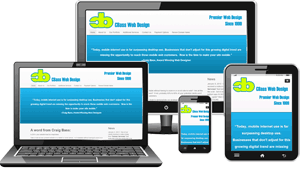
The benefits of e-commerce for small businesses
For product businesses, e-commerce is the obvious case. It extends selling beyond business hours, reaches customers outside a single neighborhood, and makes it easier to present a catalog in a way that people can browse on their own time. The less obvious case is just as important: e-commerce-style structure also improves product discovery, service selection, and lead capture.
That is why the best question is not “Do I need a full online store?” but “What parts of my sales process should happen online?” For some businesses, the answer is full checkout. For others, it is booking, estimates, subscriptions, or a simple request form. Practical guides from Shopify on building a site that sells and the mobile-first indexing explanation are useful reminders that the customer journey and search visibility now overlap more than they used to.
| Business goal | Mobile-first feature that supports it | Why it matters |
|---|---|---|
| Sell products online | Clear product pages, large tap targets, simple checkout | Reduces friction when people are buying from a phone |
| Generate leads | Short quote forms, click-to-call, contact prompts | Helps visitors act while interest is highest |
| Support local service work | Booking requests, menus, service cards, FAQs | Makes it easier to choose and schedule without confusion |
| Build trust | Reviews, policies, photos, clear business details | Signals that the business is real, reachable, and organized |
What a mobile-friendly website should get right
A responsive layout is the starting point, not the finish line. A site can technically fit on a small screen and still be unpleasant to use. Watch for these criteria:
- Fast load times so visitors do not abandon the page before it appears.
- Clear navigation with visible menus and obvious next steps.
- Readable text without zooming or sideways scrolling.
- Large tap targets for buttons, product filters, and form fields.
- Simple checkout or contact flow with as few unnecessary steps as possible.
- Trust signals such as reviews, service areas, return policies, and contact options.
Google’s own mobile sites guidance is not a design manifesto, but it does confirm the direction of travel: search systems expect the mobile version to be the primary version. That creates a simple rule for owners—if the mobile experience is weak, the site is not fully ready.
Examples of effective mobile-first website patterns
You do not need a flashy build to make this work. Some of the strongest mobile-first sites are straightforward because they respect the user’s time. Good examples usually share the same pattern:
- product grids that are easy to scan with one thumb;
- sticky or highly visible cart and contact actions;
- minimal checkout fields;
- prominent store hours, pickup details, or service coverage;
- clean page hierarchy so the customer does not have to guess what matters.
If you want a practical benchmark, compare your site with the mobile experience described in mobile-first indexing guidance or with established retail patterns from major storefronts. The point is not to imitate their scale. It is to borrow the discipline: fewer decisions, clearer paths, less friction.
Service businesses benefit too
Mobile-first thinking is not just for stores with a shopping cart. Service businesses often see the same pattern in a different form. A visitor may be comparing landscapers, salons, contractors, accountants, or consultants on a phone while standing in line or between appointments. If the site makes it hard to request a quote or understand the service list, that visitor tends to move on.
For service businesses, the best mobile-friendly features are usually:
- short quote or consultation forms,
- click-to-call and clear contact options,
- booking or request-a-time tools,
- portfolio galleries that load cleanly on mobile,
- service pages written in plain language.
That approach fits naturally with CBass Web Design’s services, portfolio examples, and the broader guidance on the home page. For a visitor, clarity beats cleverness. Usually by a wider margin than we would like to admit.
A practical checklist for 2026
If you are planning a redesign or deciding whether to update your current site, use this short checklist:
- Test the site on a real phone, not just a desktop browser in mobile mode.
- Review your top pages: home, products or services, contact, and checkout or quote flow.
- Measure whether visitors can complete the main action in a few taps.
- Look for slow images, crowded menus, or forms that are too long.
- Confirm that your most important information is easy to find without zooming.
- Decide whether your site needs a redesign, a focused mobile cleanup, or a stronger e-commerce setup.
If you want a broader planning reference, the About page and blog can help frame the work before you make design decisions.
Conclusion
In 2026, mobile-first design is not an optional enhancement for small businesses. It is a reasonable default for reaching customers who browse, compare, and buy on phones. E-commerce features make that experience more useful, whether the business sells products, appointments, or project-based services.
The old message still holds: life is mobile. The only real question is whether your website is ready for it. If you are reviewing your current site, contact CBass Web Design to talk through the safest next step for your business.