Why Responsive, Accessible Websites Matter More Than Ever in 2026
Why responsive design matters in 2026
Most visitors now meet a business website on a phone first, not a desktop monitor. That is not a trend to admire from a safe distance; it is the floor. When a page is hard to read, hard to tap, or slow to settle, people notice quickly and move on.
Google has long recommended responsive web design for mobile-first indexing, and web.dev’s design guidance still treats responsive layouts as the practical default for modern sites. For a small business, that usually means one website that adapts cleanly across phones, tablets, laptops, and large screens instead of separate versions that drift apart over time.
A useful reality check: if a customer can understand what you do, find the next step, and tap the right button without zooming, you are on the right track.
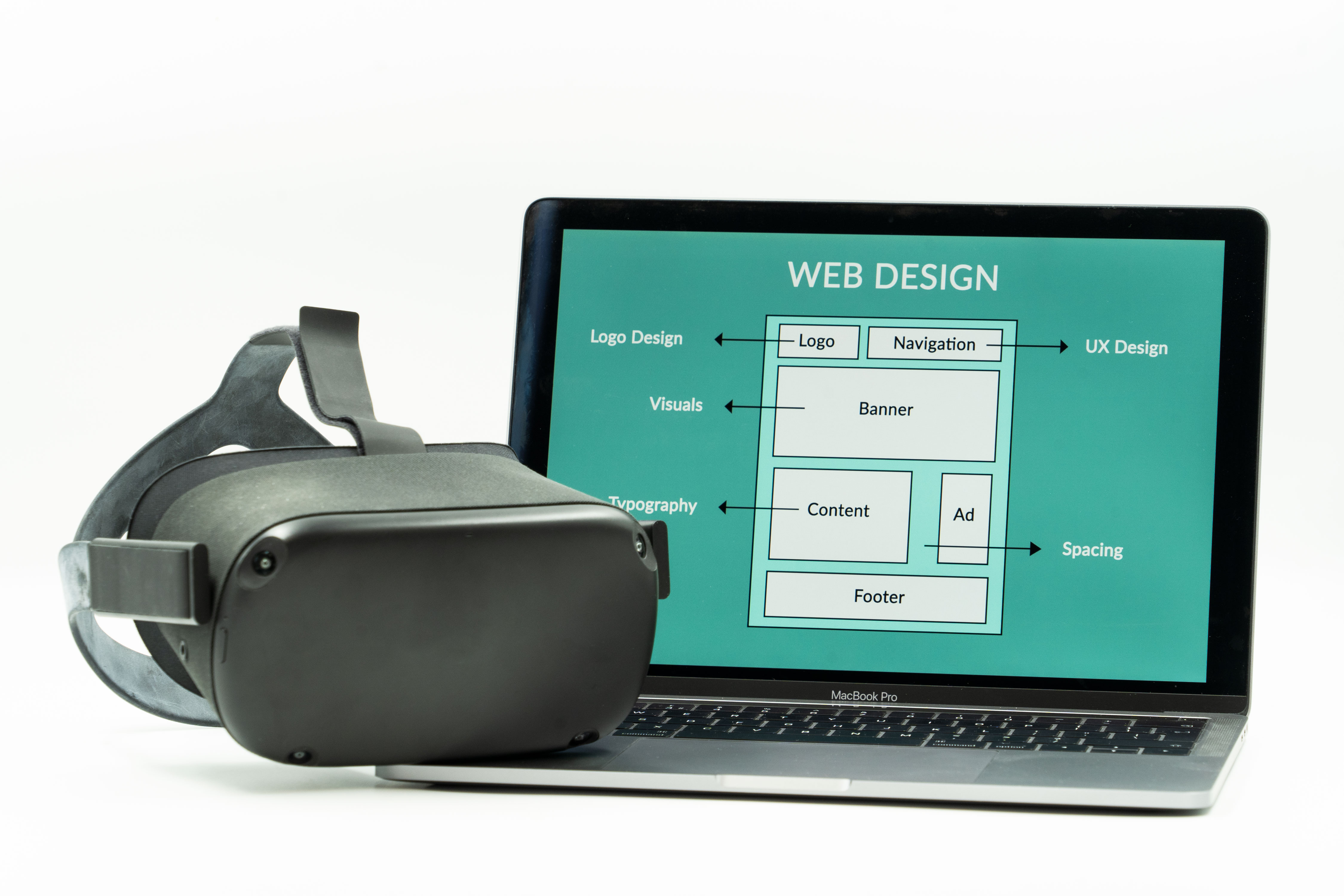
What responsive design means today
Responsive design is not just about shrinking content. It is about letting the layout respond to the space available.
- Fluid layouts let columns and sections resize instead of locking into one fixed width.
- Flexible media keeps images and video from breaking the layout on narrow screens.
- Modern CSS patterns such as Grid and Flexbox help content rearrange naturally.
web.dev’s responsive design introduction explains the idea plainly: content should adapt to the user’s screen, not the other way around. That matters because screen sizes are only part of the story. People browse while walking, waiting, multitasking, or using assistive technology. A website that assumes a desktop desk chair is making a bet it no longer needs to make.
A practical example: a services page might show three columns on desktop, then stack those services into one clean column on mobile with larger buttons and shorter paragraphs. Nothing fancy. Just readable.
Accessibility basics every business site should cover
Accessibility helps people who use assistive technology, but it also helps everyone who has ever used a keyboard, a small phone, a cracked screen, or a bright sunlit parking lot. In other words, most of us.
- Keyboard access: Can you move through the menu, forms, and buttons without a mouse?
- Visible focus: When you tab through the page, can you see where you are?
- Target size: Are links and buttons large enough to tap comfortably?
- Clear navigation: Does the visitor always know where to go next?
The W3C’s WCAG 2.2 update highlights newer guidance around focus appearance, target size, consistent help, and accessible authentication. The WCAG 2.2 recommendation is the standard reference. It does not turn a website into a finished product by itself, but it gives you a clear planning target.
If you want a plain-language overview of practical accessibility steps, W3C’s WCAG quick reference is useful for checking what needs attention before a redesign or content refresh.
Why WCAG 2.2 belongs in website planning
Accessibility is easier to build in than to retrofit. That is the part nobody loves, but it remains true.
WCAG 2.2 matters because it reflects how people actually use websites now. Focus visibility helps keyboard users keep their place. Larger tap targets reduce accidental taps on phones. Clear, consistent help prevents visitors from getting stuck halfway through a form or checkout. These are small details with outsized effects.
For a small business, the goal is not to chase a certificate for its own sake. The goal is to make the site usable enough that visitors can complete the task they came for. If they can contact you, request a quote, read your services, or find support without friction, the website is doing useful work.
Performance and compatibility still matter
A responsive site can still feel clumsy if it is heavy, unstable, or inconsistent across browsers. Speed is part of usability.
web.dev’s Baseline 2026 is a good reminder that modern web work should lean on features that are broadly available now, not on clever tricks that only behave well in one environment. Keep the page simple enough that it loads quickly, reads cleanly, and stays stable when the browser changes.
That usually means:
- compressing images before upload,
- avoiding layout shifts when fonts or images load,
- keeping scripts and animations modest,
- testing on at least one phone, one tablet, and one desktop browser.
Performance is not about shaving milliseconds for bragging rights. It is about not making people wait for a button they already know they want to press.
Checklist for a small business website refresh
Use this quick review before you redesign or update content:
- Does the homepage explain what the business does in the first screen or two?
- Do navigation links work well on a phone without zooming?
- Are paragraphs short enough to scan on a small display?
- Do images resize without cutting off important details?
- Can a keyboard user reach the main menu, forms, and calls to action?
- Is the focus state visible when tabbing through the page?
- Are buttons and links large enough to tap comfortably?
- Do forms have labels, helpful instructions, and clear error messages?
- Does the site stay readable if images take longer to load?
- Have you tested the page on more than one device and browser?
If two or three answers are shaky, that is usually a sign the site needs a refresh rather than another tiny patch.
How a local web designer can help
A good web designer does more than change colors and move blocks around. They help connect structure, content, and usability so the site works in the real world.
That often includes:
- reviewing the layout for mobile behavior,
- simplifying page structure and navigation,
- checking image choices and alt text,
- making forms easier to use,
- spotting problems before customers do.
If you want to see the broader service context, start with the services page or learn more about CBass Web Design. When you are ready to talk through a specific issue, the contact page is the next sensible stop. And if you are maintaining your own site, the support page can help with the day-to-day side of things.
What a practical website review should cover
Before you ask for a quote or a redesign, compare the current site against these questions:
- Can a new visitor understand the offer quickly?
- Does the site work cleanly on a phone held in one hand?
- Are the most important links obvious and easy to tap?
- Do the pages feel calm, or do they fight the user for attention?
- Is there a clear path from reading to contacting you?
If the answer to any of those is no, that is useful information. Websites tend to improve when someone is willing to notice the awkward parts.
Take the next step
If your site has not been reviewed in a while, start with one page and one device. Check the layout, the text size, the tap targets, and the navigation. Then compare that experience on a phone and a desktop.
For a more complete review or a new build, request a quote or website review. A few careful changes can make a site easier to use, easier to trust, and easier to keep up over time.