How to Use Analytics to Improve Your Website
Written by June Park | Updated July 9, 2026
Website analytics are the tiny but useful kind of honesty. They do not care how much you like a page. They care what people actually do with it. That is annoying in the best way. A dashboard will happily point at your favorite homepage section and whisper, “Actually, visitors left three seconds earlier.” Rude. Also helpful.
If your website feels busy but not especially effective, analytics are the fastest way to stop guessing. They can show where visitors arrive, what they read, which pages they skip, and where the whole journey gets stuck. The goal is not to collect numbers for sport. The goal is to turn those numbers into clearer pages, better calls to action, and fewer interface problems that make people sigh at their screens.

For a plain-language overview, web analytics is the practice of measuring how people use a website so you can improve it. Google’s Analytics platform is one common place to gather that data, while Search Console helps you see how a site shows up in Google Search. Different tools, same basic idea: make the invisible parts of a visit visible enough to act on.
Understanding website analytics
At its simplest, analytics answer a few stubborn questions:
- Where are visitors coming from?
- What page did they land on first?
- What did they do next?
- Did they complete the action the site was built for?
- What device, screen size, or browser were they using when things went sideways?
That last question matters more than people expect. A website can look calm and cooperative on a large monitor and then turn into interface friction on a phone. Analytics help you catch that mismatch before it becomes a long, expensive rumor.
Think of analytics as a flashlight, not a scoreboard. A scoreboard tells you who is winning. A flashlight tells you where the hallway is crooked, where visitors hesitate, and where the door handle is harder to find than it should be.
What analytics can reveal quickly
- Which pages bring the most traffic
- Which devices people use most often
- Which traffic sources send the most interested visitors
- Where people drop off before converting
- Whether a redesign helped or just looked confident
If you want a broader definition of the field, the basic idea behind analytics also connects to measurement in tools like Core Web Vitals, which focus on loading speed, interaction, and visual stability. In other words, what people experience on the page matters just as much as what your dashboard reports about it.
Key metrics to track
Good analytics habits start with a short list of metrics that actually support decisions. Too many reports and nobody moves. Too few reports and everyone improvises. The sweet spot is a small set of numbers tied to real business questions.
| Metric | What it tells you | What to do next |
|---|---|---|
| Landing pages | Which pages people see first | Make sure those pages explain the offer fast and link to the next step |
| Traffic source | Whether visitors came from search, social, email, or referrals | Match the page message to the channel that brought them in |
| Device category | Whether visitors are on desktop, tablet, or mobile | Fix mobile layouts, button sizes, and form friction if phone traffic is heavy |
| Engagement or time on page | Whether people stay long enough to read and act | Strengthen the headline, opening paragraph, and internal links if attention drops early |
| Conversions | Whether the site actually produces the action you want | Track quote requests, calls, form submissions, downloads, or bookings |
| Exit pages | Where visitors leave | Check whether those pages need clearer content, a better CTA, or a cleaner path forward |
For search-specific visibility, Search Console is useful because it helps you see what people searched for before they reached your site. That is a neat little plot twist when your homepage copy says one thing and searchers are clearly asking for another. The numbers usually do not lie. They just arrive with the emotional intelligence of a tax form.
One practical rule: if a metric does not help you decide whether to change a page, improve a form, or rewrite a call to action, it probably belongs in a nice report and not in your weekly decision-making stack.
Setting goals with analytics
Analytics work best when they are tied to a real goal. “Get more traffic” is vague. “Increase quote requests from the services page” is useful. “Reduce mobile form drop-off on the contact page” is even better. Specific goals make the numbers behave like tools instead of decorative wallpaper.
A clean way to set goals is to pick one primary action for each important page. A homepage might push visitors toward services. A service page might push them toward a quote request. A blog post might push them toward a deeper read or a contact inquiry. The metric should match the page’s job, otherwise the dashboard turns into a committee meeting with no agenda.
If the reporting workflow itself becomes clunky, some teams also look at AI consulting services as a neutral third-party reference point for figuring out where automation belongs and where a human should still make the call.
A simple goal-setting framework
- Choose one page you care about most.
- Define one action you want visitors to take there.
- Pick one metric that shows progress toward that action.
- Review the data weekly or monthly, not every seventeen minutes.
- Make one improvement, then measure again.
That last step matters. Analytics only improve a website when they lead to a change. Otherwise they are just expensive anxiety with graphs.
Using data for design decisions
This is where analytics become practical instead of ceremonial. Data can tell you whether a hero section is too crowded, whether a contact form is too long, whether a navigation label is unclear, or whether the mobile layout needs a less dramatic relationship with the tap target.
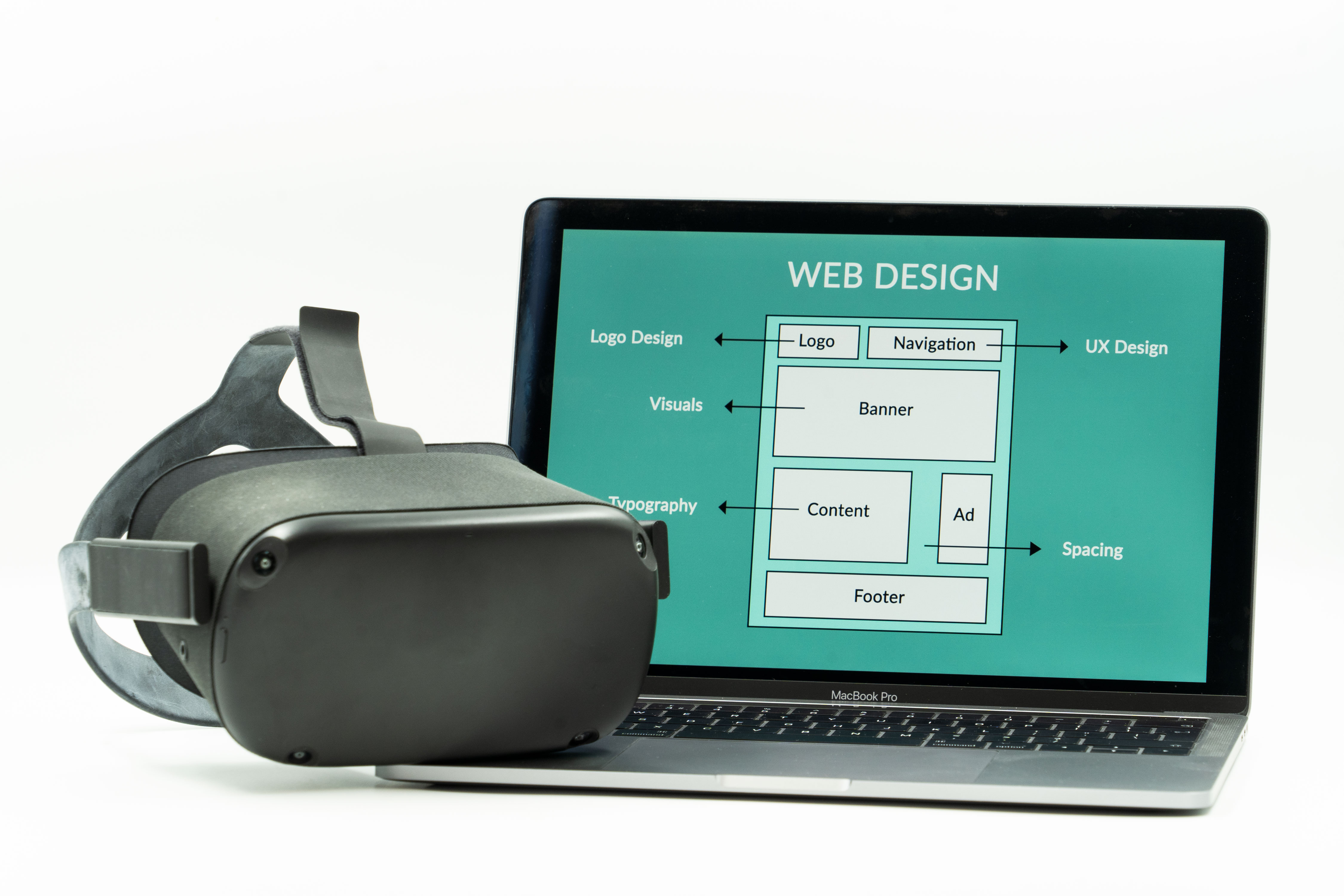
Google’s guidance on Core Web Vitals is a useful reminder that design decisions affect real visitor experience. Speed, layout stability, and responsiveness are not abstract technical virtues. They are the difference between a page that feels ready and a page that feels like it is still putting on its shoes.
Examples of design changes analytics can justify
- If mobile visitors leave quickly, reduce clutter and move the main CTA higher.
- If a services page gets traffic but no inquiries, rewrite the offer and tighten the form.
- If blog readers never visit the contact page, add a clear link before the article ends.
- If one device type performs worse, inspect the layout on that screen size first.
- If search traffic lands on the wrong page, adjust internal links and page headings.
That kind of work is especially useful for local service businesses, because a site does not need more spectacle. It needs fewer dead ends. A better layout, a clearer button, or a more obvious service path can do more for conversions than a flashy animation that arrives with a confidence problem.
For teams that want a broader technical overview, the concept of web analytics is straightforward: measure the journey, identify the friction, and change the page that causes it.
Mini case studies of data-driven improvements
Here are a few simple examples of what analytics-driven improvements often look like in real life. These are not dramatic makeover stories. They are the tiny-but-useful changes that usually move the needle.
Case 1: The contact page is getting views, but not enough form submissions
What the data says: visitors land on the page, scroll a little, and leave without completing the form.
What to check: form length, button placement, mobile spacing, label clarity, and whether the page explains what happens after submission.
What often helps: shorten the form, move the CTA higher, and add a brief sentence that removes uncertainty. People like clarity. Mystery is for novels, not inquiry forms.
Case 2: The blog gets traffic, but visitors do not move deeper into the site
What the data says: readers spend time on the article and then exit.
What to check: internal links, contextual CTAs, and whether the article points people toward services or related posts.
What often helps: add a relevant link to the Services page in the middle or near the end of the article, and give readers a clean next step instead of leaving them at the end of the sentence cliff.
Case 3: Mobile traffic is strong, but conversion is weak
What the data says: the audience is there, but the interface is making them work too hard.
What to check: button size, line length, image weight, sticky elements, and whether the page looks sane on a smaller screen.
What often helps: reduce visual noise, simplify navigation, and give the main action room to breathe.
Case 4: Search traffic lands on a page that does not answer the search intent
What the data says: people arrive, skim, and leave quickly.
What to check: whether the page headline matches the query, whether the opening paragraph answers the question fast enough, and whether the page title is doing honest work.
What often helps: rewrite the intro so it answers the visitor’s question sooner and move supporting details lower on the page.
What a small, practical analytics routine looks like
You do not need a giant dashboard museum. You need a repeatable habit.
- Review one website report weekly.
- Check top landing pages and exit pages monthly.
- Compare mobile and desktop behavior before redesigning anything.
- Track conversions, not just traffic.
- Make one change, then measure the result.
That rhythm is enough to keep a website from drifting into guesswork. And guesswork is expensive because it always feels like expertise right up until it fails.
If you want a broader reading path, the blog is a good place to keep learning from the site itself instead of treating analytics like a mystery box.
What to do next
The best next step is small: pick one page, one metric, and one improvement. That could be a clearer CTA on the homepage, a shorter contact form, a better internal link on a blog post, or a more readable mobile layout. The specific fix matters less than the habit of using data to make the fix.
For a website that needs a more careful review, the right conversation is usually about structure, content, and the path a visitor takes from curiosity to contact. That is the boring magic that turns analytics into action.
Try this once: open your analytics, choose your most important page, and change one thing that the data points to instead of the thing you already liked in the design mockup. That is how websites get less chaotic and more useful.