Why Responsive, Mobile-First Web Design Still Matters for Small Businesses
Why responsive design still matters
If most of your visitors are arriving on a phone, responsive design is not a nice extra. It is the difference between a page that feels easy and a page that asks people to pinch, zoom, and guess. Small-business sites live or die on those tiny moments.
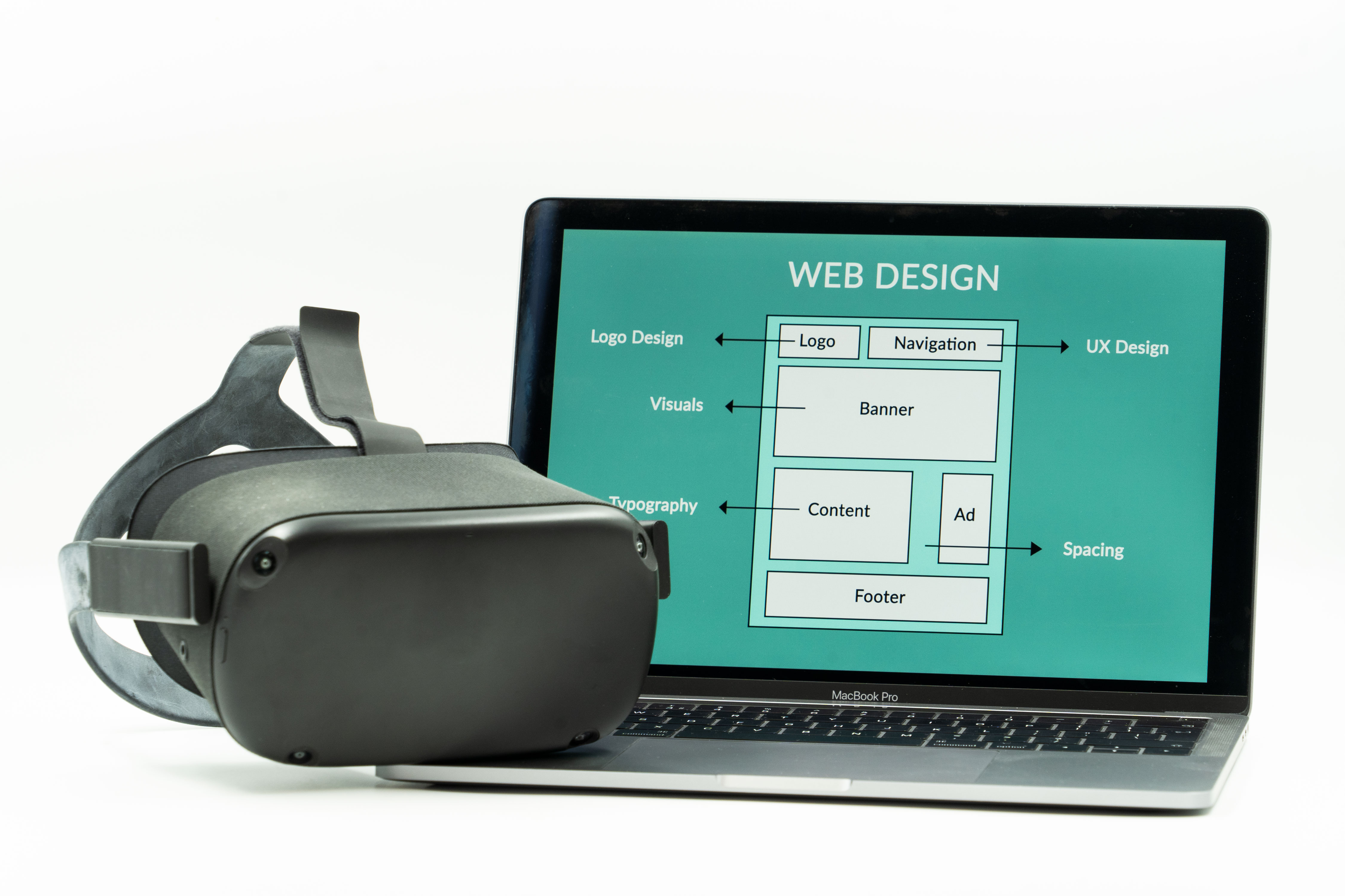
What responsive web design means
Responsive web design is a layout approach that adapts to the screen in front of it. Text reflows, images scale, navigation changes shape, and content stacks when the viewport gets smaller. Google’s mobile-first indexing guidance points to responsive design as the easiest pattern to maintain because one URL and one content set are simpler than separate desktop and mobile versions.
That does not mean every responsive site is automatically good. A cramped homepage with the wrong priorities can still be awkward on a phone. But the responsive approach gives you a better starting point than a fixed-width page that fights every screen size.
Where templates can fall short
Templates are useful when you need to move quickly, but they can become a game of furniture arrangement: the sofa fits, then suddenly the lamp is in the doorway. Many template-heavy sites end up with three problems:
- too much stuff above the fold and not enough clear next steps;
- sections that look fine in the demo but feel crowded on small screens;
- design decisions that are hard to change without editing half the site.
For a local business, that matters because the visitor is not admiring the template. They are trying to find hours, services, proof, and a way to contact you.
Accessibility is part of usability
Responsive design helps more than mobile users. W3C’s accessibility tips emphasize readable text, clear headings, sufficient spacing, and alternatives for non-text content. Their reflow guidance is especially relevant: users should be able to read content without horizontal scrolling at common zoom levels and viewport widths.
In plain English, that means a layout should not punish anyone for using a phone, enlarging text, or navigating with assistive technology. A site that reflows well usually feels calmer for everyone, even the person just trying to read your services page in a parking lot.
Why Google still favors responsive design
Google’s mobile-first indexing documentation explains that the mobile version of a site is what search systems primarily use to understand content and structure. Responsive design keeps the same content, links, and structured signals in one place, which reduces the risk of accidental mismatch. That is why responsive web design remains the safest default for small businesses that want a maintainable site.
Google also recommends keeping pages fast, avoiding blocked resources, and making sure important content is visible on mobile. Those are not glamorous requirements. They are the unglamorous socks-and-shoes of the web, which is exactly why they matter.
When a custom build is worth it
A template can be perfectly fine for a brand-new business or a very simple brochure site. But a custom build starts to make sense when the business needs a different content structure, a better mobile path to contact, or a layout that reflects how people actually compare services.
For local service businesses, that often means:
- clear service pages instead of one long generic page;
- prominent calls to action on small screens;
- proof elements such as testimonials, project examples, or service areas placed where they help decisions;
- a design system that can grow without breaking the site every time a new section is added.
If you want a broader plain-language overview of page organization, the W3C page structure tutorial is a good reference point.
Signs your site may need a redesign
| What you notice | What it usually means |
|---|---|
| You zoom in to read the page on your phone. | The text is not reflowing cleanly. |
| Buttons are tiny or crowded together. | The mobile touch targets are too tight. |
| Important info sits far below a giant banner. | The layout is built for decoration, not tasks. |
| Every new update takes a small miracle. | The template is fighting your content structure. |
None of these problems mean the site is hopeless. They do mean your visitors are doing extra work, and that rarely ends well.
A practical next step
If your site feels difficult on a phone, start with a simple review: open the home page, your services page, and your contact page on a mobile device. Ask three questions: Can I read it without zooming? Can I tell what to do next? Can I contact the business in one obvious step?
If the answer is no more often than you’d like, the design is doing less than it should. A website review is a sensible next move, and a look through the services page can help you decide whether you need a full redesign or just a cleaner mobile layout.
If you want more background on how search systems think about mobile pages, Google’s guidance on mobile-first indexing is the short version worth bookmarking.