Understanding the Basics of HTML and CSS for Web Design
If HTML and CSS still feel like two separate mysteries, this guide will make the split between them feel practical, calm, and easy to remember.
When I explain web design to someone who is just getting started, I hear the same questions almost every time: What does HTML actually do? Why do people talk about CSS as if it is a different language? How do the two pieces fit together on a real website? And, usually a little later, why does a simple change suddenly move the whole page?
That is a normal place to begin. The web is built from a few core parts, and the first two are HTML and CSS. If you want a neutral starting point, the MDN HTML basics guide, the MDN CSS first steps guide, and web.dev’s design learning path give a solid, modern foundation. I like those references because they keep the language plain and the examples close to how real pages are built.
“The Web is more a social creation than a technical one.” — Tim Berners-Lee
That line matters here because a website is not just code. It is a message, a structure, a set of choices about how people will move through information. HTML gives that message a shape. CSS gives it tone, spacing, rhythm, and a little grace. If you want to see how adaptability matters after the basics are in place, web.dev’s responsive web design basics is a useful next stop, and the W3C CSS overview shows how the styling layer is defined at the standards level.
By the end of this article, you will know what HTML is, what CSS is, how the two work together in a browser, how to read a few basic examples, and which learning resources make the next step easier. I will keep the language plain and the examples small on purpose, because simple examples are the ones people actually remember.
Terminology: the words that keep showing up
Before I get into the examples, I want to clear up the words that often get mixed together. Many beginners do not struggle with the idea of coding as much as they struggle with the vocabulary around it. Once the terms settle down, the rest of the topic becomes much less intimidating.
| Term | Expanded form | Plain meaning | Example |
|---|---|---|---|
| HTML | HyperText Markup Language | The structure of the page | <h1>Welcome</h1> |
| CSS | Cascading Style Sheets | The look and spacing of the page | h1 { color: #123456; } |
| Element | Not an abbreviation | A piece of content wrapped in tags | <p>A paragraph</p> |
| Attribute | Not an abbreviation | Extra information about an element | href="/contact/" |
| Selector | Not an abbreviation | The thing CSS is targeting | .button |
| Property and value | Not an abbreviation | The instruction and its setting | font-size: 1rem; |
There is also one phrase worth keeping in mind: the browser reads HTML first, then applies CSS to style it. That order is the key to almost everything that follows. If you remember nothing else, remember that structure comes before style.
What is HTML?
HTML is the part of the page that says, “this is a heading,” “this is a paragraph,” “this is a link,” and “this is a list.” It describes meaning and structure. It does not try to make the page pretty on its own. Instead, it gives the browser a map of the content so the browser knows what each piece is supposed to do.
I often think of HTML as the architecture of a room. It tells you where the door is, where the table sits, and which wall holds the window. A room without architecture becomes a pile of objects. A web page without HTML becomes a string of text with no order. That is why even the simplest site starts with semantic structure: headings, paragraphs, links, images, lists, and landmarks like header, main, and footer.
Here is a small example:
<!doctype html>
<html lang="en">
  <head>
    <meta charset="UTF-8" />
    <meta name="viewport" content="width=device-width, initial-scale=1.0" />
    <title>A Simple Web Page</title>
  </head>
  <body>
    <header>
      <h1>Welcome to my site</h1>
    </header>

    <main>
      <p>This is the main message on the page.</p>
      <ul>
        <li>One useful idea</li>
        <li>Another useful idea</li>
      </ul>
    </main>
  </body>
</html>
Nothing in that example is visual yet. That is fine. HTML is doing its job by telling the browser what the content means. When people say a page should be “well structured,” they usually mean it has clean HTML underneath the visible surface.
Good HTML makes a site easier to scan, easier to navigate, and easier to maintain. That is true for search engines, screen readers, and humans who are trying to understand a page quickly. It also means future updates are less likely to become a tangle of guesswork.
HTML habits that help early
- Use one clear heading structure instead of repeating random headings for style.
- Choose semantic elements like
<main>,<nav>, and<footer>when they fit the content. - Write link text that explains the destination, not generic words like “click here.”
- Keep paragraphs short enough that people can read them on a phone without losing the thread.
If HTML is the outline, CSS is the handwriting. One tells the browser what the page contains. The other tells it how that content should feel when people see it.
What is CSS?
CSS controls presentation. It handles color, spacing, size, layout, borders, shadows, and how things adapt when the screen gets smaller. If HTML is the skeleton, CSS is the clothing, posture, and room layout around it. It does not change the meaning of the content. It changes how that content is presented.
That presentation work matters more than people expect. Good CSS does not simply make a site “look nice.” It helps readers know what matters, where to look first, and how to move through the page without friction. A tidy layout can calm a reader before they have even finished the first paragraph. A cramped, inconsistent layout can do the opposite in about three seconds flat.
Here is a small CSS example:
body {
  font-family: Arial, sans-serif;
  line-height: 1.6;
  margin: 0;
  color: #1f2937;
  background: #ffffff;
}

header {
  background: #f5f5f5;
  padding: 2rem 1.5rem;
}

h1 {
  font-size: 2.25rem;
  margin: 0;
}

main {
  max-width: 720px;
  margin: 0 auto;
  padding: 2rem 1.5rem;
}

.button {
  display: inline-block;
  background: #0f766e;
  color: #ffffff;
  padding: 0.85rem 1.25rem;
  border-radius: 0.5rem;
  text-decoration: none;
}
Notice how the CSS uses selectors such as body, header, h1, and .button. That is the targeting step. Once CSS knows what it is styling, it can change the way the site feels without changing the words themselves.
CSS also introduces the idea of the cascade. That word sounds dramatic, but in practice it just means that some rules take priority over others based on where they come from and how specific they are. If two rules seem to disagree, the browser follows the cascade and specificity rules to decide which one wins. That is why a stylesheet can feel simple in one part of a project and surprisingly picky in another.
For a more formal reference point, the W3C CSS overview is helpful when you want to see the standards perspective.
CSS habits that help early
- Use spacing consistently so the page feels intentional rather than accidental.
- Set a readable font size and line height before you add decorative details.
- Use classes for reusable components instead of repeating one-off inline styles.
- Test the layout at a narrow width, not just on a big desktop screen.
Responsive design is not a separate subject from CSS. It is one of CSS’s most useful jobs. A page that works beautifully on a laptop but turns into a puzzle on a phone is unfinished, even if every color is technically correct.
How HTML and CSS work together
The cleanest way to understand the relationship is to imagine HTML as the list of ingredients and CSS as the recipe for presentation. HTML says, “this is a heading, this is a paragraph, this is a link, this is a card.” CSS says, “make the heading larger, give the card space, place the link where people expect it, and make the whole thing easier to read.”
In a real project, I usually think about the work in this order:
- Build the structure in HTML. Start with the content and mark it up in a way that makes sense.
- Add the visual layer in CSS. Set type, color, spacing, and layout.
- Adjust for different screens. Use media queries and flexible units so the page can move gracefully from phone to desktop.
- Refine the details. Tune the small things that make the page feel steady instead of improvised.
That order matters because it keeps the project honest. If the content works in plain HTML, the page already has value. CSS then lifts that content without becoming a crutch for weak structure. This is why many seasoned developers talk about “progressive enhancement.” The idea is simple: build the important part first, then improve the experience where the browser and the layout allow it.
To make this clearer, here is a side-by-side way to think about it:
| HTML responsibility | CSS responsibility |
|---|---|
| Define headings, paragraphs, links, lists, and sections | Set font sizes, colors, spacing, and alignment |
| Describe the meaning of content | Describe how the content should look |
| Keep the document understandable without styling | Improve readability and visual hierarchy |
| Help browsers and assistive technology interpret the page | Help the page adapt to the screen and feel polished |
That table is the entire job description in one glance. HTML is the meaning. CSS is the appearance. The two are separate, but neither one is useful alone for long.
If you ever feel tempted to force CSS to do the job of structure, pause. A beautiful layout built on confused HTML tends to become fragile. A clean structure with modest CSS can stay useful for years.
Basic coding examples
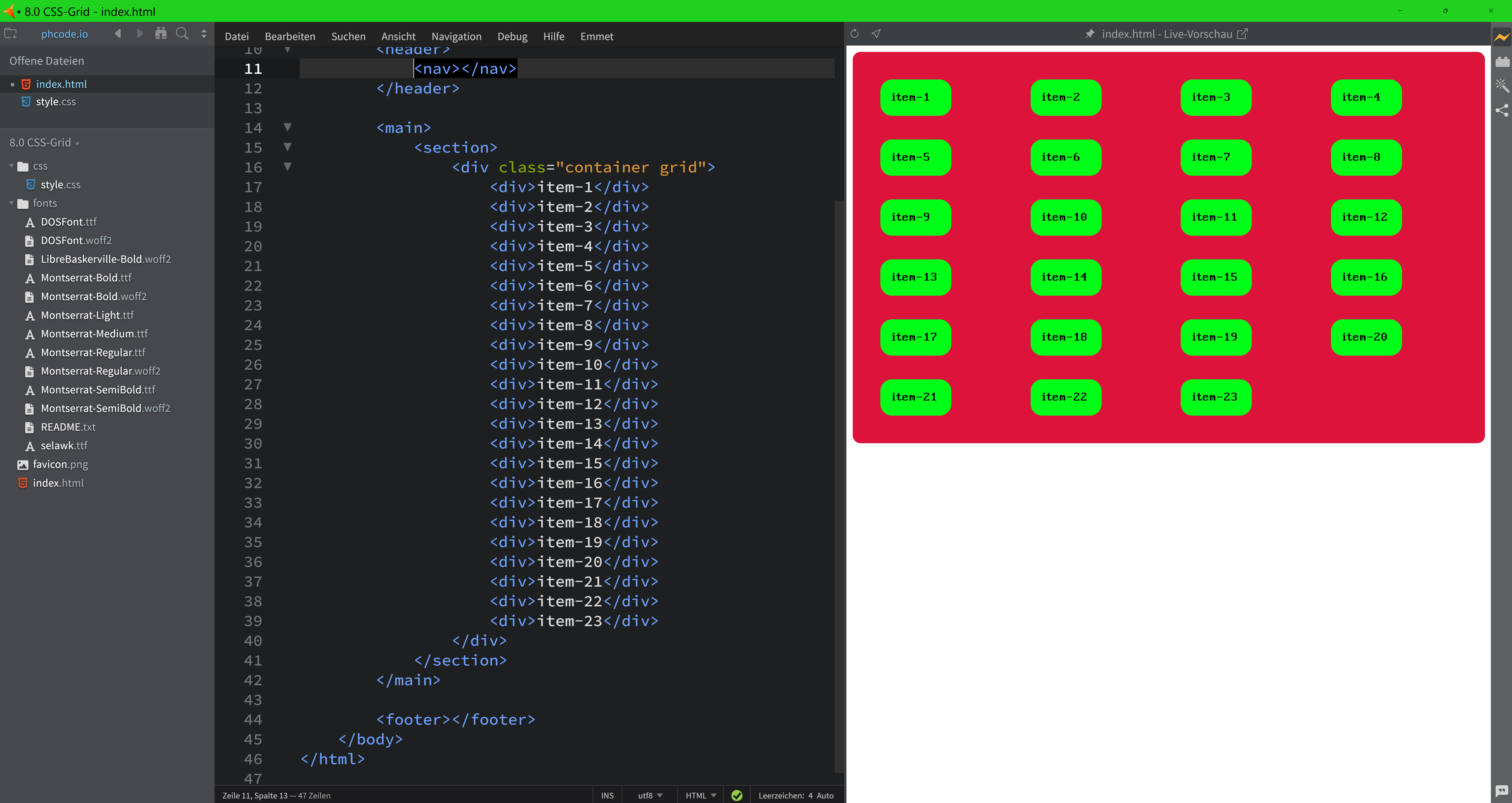
Examples are where the ideas become easier to trust. I like to start with a tiny page because small examples reveal the relationship between the files without noise. This first example shows a single HTML page linked to one stylesheet.
Example 1: a simple page with linked CSS
<!-- index.html -->
<!doctype html>
<html lang="en">
  <head>
    <meta charset="UTF-8" />
    <meta name="viewport" content="width=device-width, initial-scale=1.0" />
    <link rel="stylesheet" href="styles.css" />
    <title>Hello, web design</title>
  </head>
  <body>
    <main>
      <h1>Hello, web design</h1>
      <p>HTML gives this page meaning, and CSS gives it style.</p>
      <a class="button" href="/services/">See services</a>
    </main>
  </body>
</html>
/* styles.css */
body {
font-family: system-ui, sans-serif;
background: #f9fafb;
color: #111827;
}
main {
max-width: 700px;
margin: 4rem auto;
padding: 2rem;
background: #ffffff;
border-radius: 1rem;
box-shadow: 0 10px 30px rgba(0, 0, 0, 0.08);
}
.button {
display: inline-block;
margin-top: 1rem;
padding: 0.75rem 1rem;
background: #111827;
color: #ffffff;
text-decoration: none;
border-radius: 999px;
}That example looks small, but it already demonstrates a lot: a linked stylesheet, a readable heading, a paragraph, and a call to action. Nothing is fancy, yet the page is already more usable than a plain wall of text.
Example 2: a responsive card
.card {
  display: grid;
  gap: 1rem;
  padding: 1.5rem;
  border: 1px solid #e5e7eb;
  border-radius: 1rem;
}

.card h2 {
  margin: 0;
  font-size: 1.25rem;
}

.card p {
  margin: 0;
}

@media (min-width: 700px) {
  .card {
    grid-template-columns: 1fr 2fr;
    align-items: start;
  }
}
This second example shows why CSS matters so much to web design. On smaller screens, the card stacks naturally. On larger screens, it becomes a two-column layout. The HTML does not need to change. The design simply adapts.
That is one of the quiet powers of CSS: the same content can serve different situations without being rewritten from scratch. For a business website, that means a service overview, a contact prompt, or a portfolio item can stay readable on a phone, tablet, or desktop with the right styling rules.
Example 3: a small semantic structure
<article>
  <h2>A useful article title</h2>
  <p>An opening paragraph with the main idea.</p>
  <p>A second paragraph with a little more context.</p>
</article>
That markup is plain, but it is still useful. A browser, a screen reader, and a human scanning the page can all understand it. Add CSS later, and you can turn that same article into a card, a feature block, or a highlighted note.
If you want to see how this thinking turns into a real website instead of a classroom example, the Services page shows the kind of work a web designer can provide, and the Blog keeps the learning path going with more practical topics.
Common mistakes people make at the start
Most beginners do not make dramatic mistakes. They make small ones that add up. I mention that because those small issues are normal, and they are fixable. Here are the ones I see most often:
- Using HTML for appearance instead of meaning. For example, choosing a heading tag only because it looks big rather than because it is the right structural choice.
- Using CSS to patch over weak structure. If the HTML is confusing, no amount of color will make it clear.
- Overusing fixed widths. A layout that only works at one size is a trap waiting for a phone screen.
- Skipping spacing. Pages without enough breathing room feel busy, even when the content is good.
- Not testing on mobile early. The phone version is not an afterthought. It is a real version of the page.
- Writing code that only the original author can untangle. Clear class names and consistent spacing are not luxury features. They are maintenance tools.
A simple rule helps here: if the page makes sense in plain HTML, styling becomes easier later. If the page only makes sense after the CSS arrives, something in the structure probably needs another look.
Resources for learning HTML and CSS
When people ask me where to begin, I usually recommend a short list instead of a giant library of links. The goal is not to collect resources. The goal is to keep moving. These are the ones I would hand to someone who wants a steady starting point:
- MDN HTML basics for a clear introduction to structure and common elements.
- MDN CSS first steps for the opening concepts of styling and selectors.
- web.dev design learning path for modern layout thinking and practical design habits.
- Responsive web design basics for adapting layouts across screen sizes.
- W3C CSS overview for the standards-level view of how styling works.
You do not need to master all of that in one sitting. In fact, trying to do everything at once is a good way to make a simple subject feel hostile. Start with HTML structure, then move to CSS colors and spacing, then practice responsive adjustments. That sequence keeps the learning curve manageable.
If you are learning because you want to build or improve a real site, a good next move is to look at the business side too. The Services page explains how a design process can support a site from idea to launch, and the Blog offers more articles that connect design basics to real website decisions.
Why the basics still matter
It is easy to think HTML and CSS are only for beginners because they come first. That is a mistake. The basics never stop mattering. Even advanced layouts still depend on the same foundation: meaningful structure, readable text, sensible spacing, and styles that adapt when the screen or the content changes.
When a site feels off, the problem is often not mysterious. The heading hierarchy may be weak. The spacing may be too tight. The layout may ignore smaller screens. Or the style may be hiding the content instead of supporting it. The nice thing is that HTML and CSS give you ways to fix those problems directly. You do not have to guess forever.
I find that reassuring. Good web design is not about magic. It is about arranging information so people can use it without effort. HTML and CSS are the first two tools in that work, and they stay useful long after the beginner stage has passed.
Conclusion
If you remember only a few things from this article, keep these: HTML builds the structure, CSS shapes the presentation, and the browser depends on both to turn code into a usable web page. Once you understand that split, the rest of web design becomes much easier to learn.
The strongest sites begin with clear content, then add style with restraint. They are readable, adaptable, and easy to maintain. That is true whether you are building a personal project, a small business site, or a larger web presence that needs to work on phones as well as desktop screens.
If you want help turning a rough idea into a real website, start with the Services page. If you want to keep learning one topic at a time, the Blog has more practical guides. And if you are already looking at a page and wondering whether it is set up well, that is usually the right moment to slow down, read the structure, and give the design a second look.
Key points at a glance
- HTML gives a page structure and meaning.
- CSS gives a page style, spacing, and responsive behavior.
- The browser reads HTML first and then applies CSS.
- Good structure makes styling easier and maintenance safer.
- Responsive design is part of CSS, not a separate extra.
- Small, clear examples are the best way to learn the basics.