The Role of Graphics in Effective Web Design
Written by Lena Ortiz | Updated June 23, 2026
Graphics are not decoration by default. In web design, they are often the fastest way to explain priority, reduce uncertainty, and make a visitor stay long enough to understand the offer.
If you are deciding how much visual treatment a website actually needs, I would start with four questions: What should the visitor notice first? What should the page explain in one glance? Which details need proof rather than plain text? And where does a graphic improve clarity instead of adding noise?
Jeffrey Zeldman’s line still holds up: “Content precedes design. Design in the absence of content is not design, it’s decoration.” The same standard applies to graphics. A graphic is useful when it helps the content do its job better.
This matters because users do not experience a page as a document. They experience it as a sequence of visual decisions: image, heading, spacing, contrast, icons, and motion. Accessibility guidance from the W3C on non-text content and performance guidance from web.dev on image performance both point to the same practical truth: graphics should help users understand and navigate, not slow them down or leave them guessing.
By the end of this article, you should be able to judge which graphic types belong on a page, how to balance visuals with copy, what to avoid when speed and accessibility matter, and how to evaluate a few real-world examples without falling for empty style.
Why graphics matter in web design
Graphics do three jobs well when they are chosen carefully. They capture attention, they communicate structure, and they shape perception. That is a useful set of roles because most visitors do not read a page from top to bottom with saintly patience. They scan, compare, and decide whether the page feels trustworthy enough to continue.
I treat graphics as a form of evidence. They can show a product, frame a process, reinforce a brand, or make an abstract idea concrete. A graphic that performs one of those jobs is working. A graphic that only fills space is taking up rent without paying it.
There is also a trust component. A consistent visual language can make a site feel established and intentional. Poorly chosen graphics do the opposite. They make the site feel improvised, which is rarely the message a business wants to send.
What users infer from visuals
- Quality: crisp, relevant visuals suggest care and competence.
- Clarity: diagrams, icons, and screenshots can explain complex steps faster than prose.
- Brand consistency: a shared color, illustration, or photography style makes the site feel coherent.
- Confidence: proof-oriented visuals reduce uncertainty before a user contacts you or buys.
The key point is not that every page needs more graphics. It is that the right graphic can reduce mental work. That usually improves engagement because the visitor spends less effort decoding the page and more effort deciding whether it fits their need.
For businesses comparing how much visual design support they need, the services page is the practical starting point. It is easier to choose the right visuals when the service structure is already clear.
Types of graphics to use
Different graphics solve different problems. A photo, an icon, an illustration, and a chart are not interchangeable. They may all be visuals, but they do not carry the same meaning or risk.
| Graphic type | Best use | Strength | Main risk |
|---|---|---|---|
| Photographs | People, places, products, environments, trust cues | Immediate realism and emotional context | Stock-photo sameness or misleading polish |
| Icons | Small labels, feature lists, navigation aids | Fast recognition at small sizes | Too abstract or too decorative to help |
| Illustrations | Concepts, processes, abstract services | Flexible, branded, easy to simplify | Style drift if the system is not consistent |
| Infographics | Comparisons, workflows, statistics, summaries | Compresses information into a scannable format | Becomes too dense or unreadable on mobile |
| Screenshots | Software, dashboards, forms, workflows | Shows the real interface and reduces ambiguity | Tiny text and clutter if the crop is poor |
1. Images and photographs
Photographs work best when the visitor needs realism. A service business can use a photo of a team, workspace, or completed project. A retail site can show the product in use. A nonprofit can show the setting or the people served. The photograph should answer a question, not merely decorate the header.
The safest rule is simple: use a photo when the image can make the offer feel more concrete. If the page is about a physical environment, a photo often helps more than a custom illustration. If the page is about a process or concept, the photograph may distract instead of clarify.
One practical benefit is emotional context. A good photograph can establish mood and credibility faster than a paragraph. But that only works if the image is honest. Overly staged or generic stock photography can flatten the brand into something forgettable. That is how you end up with the digital equivalent of beige carpet.
2. Icons and illustrations
Icons are useful when the page needs quick scanning. They pair well with feature lists, navigation items, benefit blocks, and short labels. The best icons are simple, consistent, and legible at small sizes.
Illustrations serve a broader purpose. They can explain an abstract idea, create a recognizable visual system, or make a service feel more approachable. For many service businesses, illustration is a better fit than photography when the offer itself is intangible. You cannot photograph “website strategy” directly, but you can still make it feel visible with a smart illustration system.
The decision is not icons versus illustrations in the abstract. The decision is whether the visual should be read instantly or whether it should carry more narrative weight. Icons are for quick recognition. Illustrations are for explanation and brand tone.
3. Infographics and data visualizations
Infographics are best when the page needs to compare, summarize, or show relationships. They can be powerful on a landing page, a case study, or a report page. They are also the easiest type of graphic to abuse, because dense information looks impressive right up until nobody can read it.
A useful infographic should answer one clear question. What changed? What compares to what? What is the sequence? What does the number mean? If the graphic needs a long explanation in the caption, it is probably too complicated.
When a business has real data to show, charts are often more useful than decorative art. But the design must respect the medium. Mobile users do not want to pinch-zoom their way through a tiny legend. That is a design failure with better branding.
Examples of graphics in web design
The best way to evaluate graphics is to see how they behave in a real page context. The examples below are not perfect templates. They are decision cues.
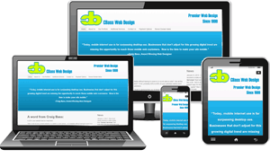

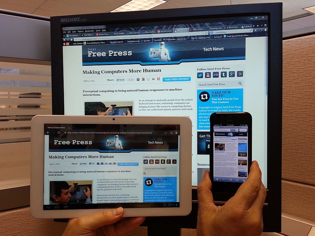
Those examples show different jobs rather than different levels of quality. The responsive layout image helps a visitor understand device fit. The workspace image supports a process-oriented service story. The redesign illustration suggests transformation. In a real site, I would choose among them based on the page objective, not because one is more fashionable than another.
That distinction matters. The wrong image often does not fail loudly. It simply creates a subtle mismatch between what the page promises and what the visitor feels. The page may still look fine. It just feels less convincing than it should.
Best practices for graphic design
Once the graphic type is chosen, execution matters. The goal is not to impress another designer in a hallway. The goal is to help a visitor make a decision.
Keep graphics relevant
Every visible graphic should answer a question the page already raised. If the page is about web design services, show work that looks like web design services. If the page is about support, show how support works. If the page is about process, show the process. Relevance is not optional; it is the cost of admission.
Graphics that are only “nice” often lose to graphics that are specific. Specificity creates credibility. A visitor can tell the difference.
Maintain consistency in style and branding
Do not mix illustration systems, icon stroke widths, photo moods, and color treatments without a reason. A site can absolutely use multiple graphic types, but they should feel like they belong to the same family. Consistency reduces friction because the user does not have to re-learn the visual language on every section.
Good consistency is usually less about strict repetition and more about controlled variation. Change the image type when the message changes. Keep enough shared structure that the site still feels like one identity. Brand systems exist for this reason. Without them, every page starts making its own rules.
Optimize for loading speed
Google’s image guidance is worth reading closely because performance is not a separate issue from design. Large graphics, uncompressed photos, and decorative assets that carry no information can drag down the page and make the visual design feel slower than it should.
The practical checklist is short:
- Use the right file format for the job.
- Resize images to the size they are actually displayed.
- Compress photos before upload when possible.
- Avoid stuffing huge images into small mobile layouts.
- Keep decorative graphics lightweight.
Performance and aesthetics are not opposites. A well-optimized image is both easier to use and easier to trust. Slow graphics are usually not luxurious. They are just slow.
Design for accessibility
The W3C’s guidance on non-text content is useful because it frames graphics as part of the information system, not a separate layer. If an image carries meaning, it needs a meaningful text alternative. If it is purely decorative, it should not clutter the experience for screen reader users.
Accessibility also affects visual design choices. Text on images should be used sparingly. Color contrast should be strong enough to read. Complex graphics should not be the only place where important information lives. If the only version of the message is visual, then the message is too fragile.
Use hierarchy intentionally
Graphics should support hierarchy, not flatten it. The page still needs a main headline, a primary call to action, and a clear reading order. Visuals can reinforce that order by drawing the eye to the right section at the right time.
The best pages often do something very ordinary very well: they place one strong visual where it helps the main message, then they get out of the way. You do not need five competing hero images. You need one clear argument and visuals that support it.
Balancing text and graphics
The balance question is where many pages go wrong. Too few graphics and the page may feel dry, unclear, or unconvincing. Too many graphics and the page becomes busy, slow, and hard to scan. The right answer depends on the user’s task.
I use three practical checks.
- Can the visitor understand the page without reading every word? If not, the visuals are probably not doing enough.
- Can the visitor still understand the page if the image fails to load? If not, the visual is carrying too much weight.
- Does every visual support the next decision? If not, it is probably decorative clutter.
That sounds strict because it is. A website has one job: move a visitor toward a useful decision. If a graphic does not help with that task, the design can usually survive without it.
There is also a sequencing issue. Put the most important text near the most important image. Use the graphic to confirm the meaning of the copy, not to compete with it. A well-placed image can make a headline easier to believe. A poorly placed one can make the message feel accidental.
Common balance mistakes
- Decorative overload: too many visuals with no clear purpose.
- Caption neglect: images with meaning but no supporting explanation.
- Copy starvation: pages that rely on visuals to explain what text should have said.
- Layout mismatch: graphics that look good on desktop but break on mobile.
If a page needs graphics only because the copy is weak, fix the copy first. That is the more economical decision. If a page needs graphics because the offer is complex, then the visuals are part of the solution and should be designed with that responsibility in mind.
Case studies of effective graphic use
Case studies are useful because they show how graphics behave under real business constraints. The point is not to copy the exact look. The point is to understand the tradeoff the designer made.
Case study 1: Stripe
Stripe is a strong example of using graphics to make a complex technical product feel legible. Its visual language often combines clean illustration, restrained color, and a disciplined layout. The result is not merely attractive. It supports the product story by making abstract financial infrastructure feel more approachable.
What works here is restraint. Stripe tends to use graphics to clarify the idea, not overwhelm the argument. That matters because the product itself is technical. A louder visual system would make the page look busy rather than trustworthy. You can review the brand’s current presentation on Stripe’s website.
The lesson is simple: when the service is complex, graphics should reduce the burden of explanation. They should not become a second, competing product.
Case study 2: Airbnb
Airbnb uses photography to do work that words cannot do quickly. A place listing or travel page needs context, atmosphere, and a sense of real-world trust. Good imagery helps set expectations before the user reads every detail. It also gives the user a fast emotional preview of what booking might feel like.
That is different from using photos as decoration. The visuals on a travel platform are part of the decision process. People are trying to imagine themselves in a space, in a city, or in a setting they have not experienced yet. You can see the company’s visual approach on Airbnb’s website.
The lesson here is that photography is strongest when it creates confidence through specificity. A vivid, honest image can help a visitor move from curiosity to action faster than a paragraph of polished copy.
Case study 3: GOV.UK and public service pages
Public service sites often use fewer graphics, but that is itself a design choice. GOV.UK is a useful reference because it prioritizes clarity, accessibility, and task completion over visual flourish. In some cases, the absence of heavy graphics is the point. The interface needs to make information easy to find, not make the page feel premium in the marketing sense.
That does not mean the site is visually weak. It means the graphic system is intentionally minimal. The lesson is useful for business sites too: graphics should match the task. A form page, policy page, or support page often benefits from less visual noise, not more. You can review the service’s approach on GOV.UK.
The lesson here is not “use no graphics.” The lesson is “use the fewest graphics needed to make the task easier.” Sometimes the cleanest visual choice is to stop before the page starts talking too much.
How to decide what belongs on a page
If you are deciding between two visual treatments, use criteria instead of instinct alone. I would compare the options on five questions:
| Decision criterion | Ask this | Prefer the option that… |
|---|---|---|
| Clarity | Does it explain the offer faster? | reduces confusion in the first few seconds |
| Relevance | Does it match the page purpose? | fits the actual service or message |
| Consistency | Does it feel like part of the same brand system? | matches the site’s tone and layout |
| Performance | Does it keep the page fast enough to use? | loads quickly and scales cleanly |
| Accessibility | Can the meaning survive beyond the image itself? | works with alt text, contrast, and responsive layout |
This kind of review keeps the decision grounded. Many design debates sound subjective until you translate them into criteria. Then one option usually wins for plain reasons, which is the healthiest kind of victory.
If the page is a portfolio or a service landing page, the right visual treatment often needs to do more than look attractive. It needs to reassure. That is why a strong portfolio page and a clear service page usually do better when the visuals are tied to real work and real outcomes, not abstract taste tests. If you want to see how that principle is organized across the site, the portfolio page is the natural place to look.
What to avoid
The mistakes below are common because they are easy to rationalize. They also weaken the page more than most teams expect.
- Using graphics to hide weak copy: no amount of visual polish fixes an unclear offer.
- Choosing generic stock visuals: if the image could belong to any company, it belongs to none of them.
- Ignoring mobile behavior: graphics that only work on large screens are unfinished work.
- Overloading support pages: the more utilitarian the page, the less patient the visitor usually is.
- Making visuals the hero when the message is the hero: the page should serve the decision, not audition for an art direction award.
A useful test is this: remove the graphic mentally and ask whether the page still makes sense. If the answer is no, the copy may be too thin. If the answer is yes and the graphic still adds little, the image is probably optional.
Practical guidance for businesses
For a small business website, the best approach is usually modest and disciplined. Use photographs when the business has real environments or people worth showing. Use illustrations when the service is abstract and a brand system is needed. Use icons to reduce friction in lists or navigation. Use charts only when they answer a decision question.
The safest default is not “more visuals.” It is “fewer, better visuals.” That means each graphic should have a job, a label, and a place in the page hierarchy. If it does not, it is probably ornamental.
That same discipline makes redesign decisions easier. If a site already has a clear service story, the visuals can do more work. If the page structure is weak, the visuals should stay quieter until the structure improves. Design, in other words, follows responsibility. Someone has to decide what matters.
Conclusion
Graphics improve web design when they clarify, reassure, and support action. They are most effective when they match the page’s purpose, reinforce the brand consistently, load quickly, and remain accessible on every device. Used well, they make a site easier to trust. Used poorly, they add weight without adding value.
The practical rule I would keep is this: choose graphics that help a visitor understand the page faster than text alone would. If a visual does that job, keep it. If it does not, the site probably has a better use for the space.
If you are reviewing a site that needs better graphics, clearer structure, or stronger presentation, the next step is usually a service review followed by a portfolio check. Start with the services page and the portfolio page, then decide whether the visuals are doing enough work or simply taking up room.
Key points:
- Graphics should reduce confusion, not add decoration for its own sake.
- Photographs, icons, illustrations, infographics, and screenshots each solve different problems.
- Relevance, consistency, speed, and accessibility are the main design checks.
- Balance matters: too many visuals create clutter, too few can weaken trust.
- Real examples like Stripe, Airbnb, and GOV.UK show different ways to use graphics intentionally.
If the page is still hard to explain after the visuals are removed, the design probably needs more than a graphic refresh. If the page works without them but improves with them, you have the right kind of graphics.